


Imagine trying to read a novel where every picture is described by a robot that only knows the word "image." That’s what a blind student experiences when they encounter a complex bar chart with no alternative text. It’s not just an inconvenience; it’s a barrier to understanding the core concept of your lesson. If you’re building online courses, you’ve likely heard about alt-text, but applying it to data visualizations is where most creators stumble. A generic label like "chart" tells the user nothing about the trend, the peak, or the relationship between variables.
This guide cuts through the noise. We aren’t here to debate philosophy; we’re here to fix your course materials so that students using screen readers get the same insights as those who can see the pixels. Whether you are teaching introductory biology or advanced finance, how you describe your graphs determines whether your content is truly accessible or just technically compliant.
Why Generic Alt-Text Fails Students
When a screen reader encounters an image without proper description, it often reads the file name. If your file is named sales_q3_final_v2.png, the student hears exactly that. It’s useless. Even if you add alt-text, writing "bar chart showing sales" is barely better. It confirms the format but hides the story. The goal of alt-text in education isn’t to describe the container; it’s to deliver the content. A student needs to know that Q3 sales rose by 15% compared to Q2, driven primarily by the European market. Without that specific insight, the visual element becomes dead weight in their learning flow.
Think about the cognitive load. Sighted students glance at a graph and instantly grasp the slope and outliers. Blind students have to parse linear information from audio. If your alt-text is vague, they have to guess the intent. This friction breaks immersion and hinders retention. In a learning context, clarity is king. Ambiguity costs grades.
The Three-Tier Approach to Describing Data
You don’t need one-size-fits-all solutions. Different charts require different levels of detail. Experts generally recommend a tiered approach based on the complexity of the visualization. This method ensures you provide enough context without overwhelming the listener with unnecessary data points.
- Tier 1: Simple Decorative or Redundant Images. If the chart merely repeats text already present in the paragraph above it, use empty alt-text (
alt=""). This tells the screen reader to skip the image entirely. For example, if you write, "Sales increased by 10%," and then show a simple line graph illustrating that exact fact, describing the graph again is redundant. Skip it. - Tier 2: Complex Informational Charts. Here, the chart contains unique information not found elsewhere. Your alt-text should summarize the main takeaway. Don’t list every single data point. Instead, highlight the trend, the maximum/minimum values, and any significant anomalies. For a pie chart, mention the largest slice and its percentage. For a line graph, describe the overall direction (upward, downward, stable) and key inflection points.
- Tier 3: Detailed Data Tables or Complex Infographics. Sometimes, a summary isn’t enough. If the precise numbers matter for a calculation or deep analysis, alt-text alone might be too long or confusing. In these cases, provide a concise alt-text summary and link to a full data table below the image. Screen reader users can navigate tables efficiently, whereas parsing a massive list of numbers from alt-text is mentally exhausting.
Crafting Effective Alt-Text: A Formula
Writing good descriptions feels awkward at first. You’re translating visual language into verbal logic. To make it easier, try this formula: [Type of Chart] + [Main Subject] + [Key Trend/Relationship] + [Notable Outlier].
Let’s apply this to a real-world scenario. Imagine a scatter plot in a psychology course showing the correlation between study hours and exam scores.
Bad Alt-Text: "Scatter plot of study hours vs exam scores." Better Alt-Text: "Scatter plot showing a positive correlation between weekly study hours and final exam scores. As study time increases from 0 to 20 hours, scores rise from 50% to 90%. There are three outliers where high study time resulted in lower scores due to reported test anxiety."
Notice the difference? The second version gives the student the conclusion and the nuance. It saves them from having to interpret the raw data themselves. Keep sentences short. Avoid jargon unless you define it. And always keep it under 150 characters if possible, though some modern screen readers handle longer strings better than older ones. When in doubt, put the critical info first.
Handling Specialized Visuals: Flowcharts and Maps
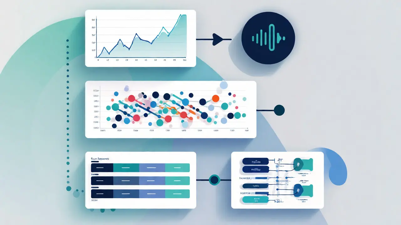
Data isn’t always numerical. Many courses rely on process flows, organizational hierarchies, or geographic maps. These require a different descriptive strategy because the "data" is spatial or logical rather than quantitative.
For flowcharts, which depict a sequence of steps or decision points in a process, start with the entry point. Describe the flow logically: "Start at 'Submit Application,' move to 'Review Status.' If status is 'Approved,' proceed to 'Enroll.' If 'Rejected,' end process." Use directional words like "left to right," "top down," or "clockwise" to help orient the listener. Spatial cues are vital here because screen readers don’t inherently understand layout.
Maps are tricky. A map of climate zones isn’t just about location; it’s about distribution. Instead of saying "Map of Europe," say "Map of Europe highlighting three distinct climate zones: Mediterranean in the south, Temperate in the center, and Continental in the east. Note the sharp boundary between Temperate and Continental along the Ural Mountains." This provides the analytical value, not just the geography.
Tools and Workflow Integration
You might be thinking, "This sounds like a lot of work for every slide." It is, but automation helps. Most Learning Management Systems (LMS) like Canvas, Moodle, or Blackboard allow you to edit alt-text directly in the editor. However, they don’t generate it for you. You need to do the heavy lifting.
| Visualization Type | Primary Attribute to Describe | Example Alt-Text Snippet |
|---|---|---|
| Bar Chart | Comparison of categories | "Bar chart comparing revenue across four quarters. Q4 is highest at $1M, Q1 lowest at $500k." |
| Pie Chart | Proportional breakdown | "Pie chart showing market share. Product A holds 60%, Product B 30%, Others 10%." |
| Line Graph | Trend over time | "Line graph tracking user growth. Steady increase until June, followed by a plateau." |
| Scatter Plot | Correlation or clusters | "Scatter plot indicating weak negative correlation between age and reaction time." |
| Infographic | Hierarchy and narrative | "Infographic outlining five steps of the scientific method, starting with observation." |
If you use PowerPoint or Keynote, there are built-in accessibility checkers. They flag missing alt-text but rarely suggest good copy. Some AI tools can now draft initial descriptions, but they often miss the educational nuance. Always review AI-generated text. Does it capture the *lesson*, or just the *pixels*?
Long Descriptions: When Alt-Text Isn’t Enough
Sometimes, a 150-character limit chokes the meaning. Think of a complex anatomical diagram or a multi-layered financial forecast. In these cases, use the longdesc attribute or a linked text description. Place a small, visible link near the image labeled "Detailed Description." Clicking it takes the user to a page or section with a thorough explanation.
Why bother with a separate link? Because screen reader users can choose to skip detailed descriptions if they only want the gist. If you cram everything into the alt-text, they hear a minute-long monologue before moving to the next paragraph. Giving them control improves the user experience. Plus, sighted students with cognitive disabilities also benefit from clear, structured text summaries alongside visuals.
Testing Your Course Accessibility
Don’t trust your eyes; trust the tool. Install a screen reader like NVDA (free for Windows), VoiceOver (built into macOS/iOS), or TalkBack (Android). Close your eyes and navigate your course module. Listen to how your charts sound. Do you find yourself rewinding to catch a number? Is the description confusing? Did you miss the key insight?
A quick heuristic: If you had to explain the chart to someone over the phone in 10 seconds, what would you say? That’s usually your perfect alt-text. It forces conciseness and prioritizes impact over completeness. Remember, accessibility isn’t a checkbox for compliance audits; it’s a quality assurance metric for your teaching effectiveness.
How long should alt-text be for a complex chart?
Ideally, keep it under 150 characters. If the chart is highly complex, use a brief alt-text summary and provide a link to a longer, detailed description or a data table. This prevents overwhelming the screen reader user with excessive audio output.
Should I include the word "image" or "graphic" in my alt-text?
No. Screen readers automatically announce that an element is an image. Saying "Image of a bar chart" results in the user hearing "Image, Image of a bar chart." Just start with "Bar chart..."
What if the chart has a title inside the image itself?
If the title is baked into the image pixels, you must repeat it in the alt-text so the screen reader picks it up. However, it’s better practice to place titles as actual HTML text headers above the image, keeping the alt-text focused on the data trends.
Do decorative charts need alt-text?
If the chart adds no new information beyond the surrounding text, use null alt-text (alt=""). This tells assistive technology to ignore the image entirely, reducing auditory clutter for the user.
Can I use AI to generate alt-text for my course slides?
Yes, AI tools can provide a solid starting point by identifying objects and colors. However, they often fail to interpret educational context or trends. Always manually edit AI suggestions to ensure the pedagogical message is clear and accurate.
Comments
Tommy Cahyadi
Oh great, another guide telling me I'm doing it wrong. I've been using "chart" for ten years and nobody died.
Anthony .
This is actually super helpful! 🌟 The tiered approach makes so much sense. It’s not about dumping all the data, but about giving the right amount of context. We need to remember that accessibility is an act of care for our learners. 💖📚
Ejike Ugwu
They don't want you to know this because if everyone used proper alt-text, the AI companies would lose their monopoly on image recognition data. They keep us lazy with generic tags so they can scrape everything without permission. Wake up!
Marisa Marroquin
I must say, the distinction between decorative and informational visuals is a breath of fresh air in this often murky landscape. It is quite elegant how you suggest using null alt-text for redundant images; it truly declutters the auditory experience for those relying on assistive technology. One cannot help but appreciate the thoughtful structure here.
Kathleen Johnson
While the advice is generally sound, the suggestion to link to data tables for Tier 3 charts is frankly inefficient for mobile users who are already struggling with screen reader navigation speeds. Most LMS platforms handle table navigation poorly, creating more friction than the long alt-text you claim to avoid. This seems like a theoretical solution rather than a practical one for current tech limitations.
Lauren Martin
The pedagogical implication of vague alt-text is catastrophic for cognitive load theory. If the student has to parse linear audio data to reconstruct spatial relationships, you are fundamentally breaking the schema acquisition process. It's not just about compliance; it's about ensuring the semantic integrity of the visual metaphor translates to the auditory channel without degradation.
jyotshna Senapati
Excuse me, but did anyone else notice that this article completely ignores the cultural context of color blindness? You talk about trends and peaks, but what about the emotional weight of color choices in different cultures? This feels very US-centric and shallow.
Liam Whelan
ugh finally someone says it
i hate when i have to listen to "image of graph showing sales" over and over again its so annoying :( why cant people just describe the damn trend?? :P
Elizabeth Calwell
This is exactly the kind of practical guidance we need! I've been trying to implement these changes in my own course materials, and seeing the formula broken down like this gives me the confidence to tackle my backlog of slides. Keep up the amazing work advocating for inclusive education! 🙌✨
Mithilesh Singh
It is high time that educators took responsibility for their own laziness. Instead of blaming software or lack of time, one should simply put in the effort to write clear descriptions. It is a moral duty to ensure that no student is left behind due to poor preparation. There are no excuses for sloppy work in academia.
Shaina Silver-Baird
I am concerned that the push for standardized alt-text formats may eventually lead to algorithmic homogenization, where unique educational voices are flattened into machine-readable templates. Are we optimizing for human understanding or for search engine indexing? The implications for true comprehension are worth considering.
Sundaraiah Kollipara
this is good stuff
i wonder though how do we teach students to write good alt text themselves? if we only fix the teacher side then the cycle continues when they become creators later on?
maybe we need a meta layer of accessibility training in every course?
Tommy Cahyadi
@Sundaraiah Kollipara Because most people don't care enough to learn two things at once. Priorities, buddy.
Anthony .
@Tommy Cahyadi That's such a harsh way to look at it! 😅 But honestly, @Sundaraiah Kollipara, you're totally right. We should be teaching accessibility as a core skill, not just an afterthought. It empowers them to be better communicators overall! 🌈🧠