


Imagine trying to solve a complex math problem while someone is loudly explaining the rules of chess and playing loud music in the background. Your brain feels like it’s about to explode. That sensation is Cognitive Load the total amount of mental effort being used in your working memory. When this load exceeds what your brain can handle, learning stops. It doesn’t just slow down; it halts completely. For instructional designers, understanding this isn't just academic trivia. It’s the difference between a course that students actually finish and one they abandon after three modules. Instructional Design the systematic process of creating learning experiences relies heavily on managing how much information hits the learner at once. If you’ve ever felt overwhelmed by a training manual or a dense textbook, you’ve experienced poor cognitive load management firsthand.
This guide breaks down the mechanics of why our brains struggle with too much info and gives you concrete strategies to fix it. We’re not going to drown you in jargon. Instead, we’ll look at the three types of cognitive load, identify the red flags in your current materials, and provide actionable steps to streamline your content for better retention.
The Three Types of Cognitive Load You Must Manage
Not all mental effort is created equal. John Sweller, who developed Cognitive Load Theory a framework describing the limits of human working memory in relation to instruction in the 1980s, categorized load into three distinct buckets. Understanding these helps you decide where to cut fat and where to add value.
- Intrinsic Load: This is the inherent difficulty of the material itself. Learning quantum physics has high intrinsic load; learning how to make a sandwich has low intrinsic load. You can’t really change this without changing the subject, but you can break it down into smaller chunks to make it digestible.
- Extraneous Load: This is the "noise." It comes from bad design choices-cluttered slides, confusing navigation, irrelevant details, or poor visual hierarchy. This is the type of load you have full control over, and it’s the first thing you should eliminate.
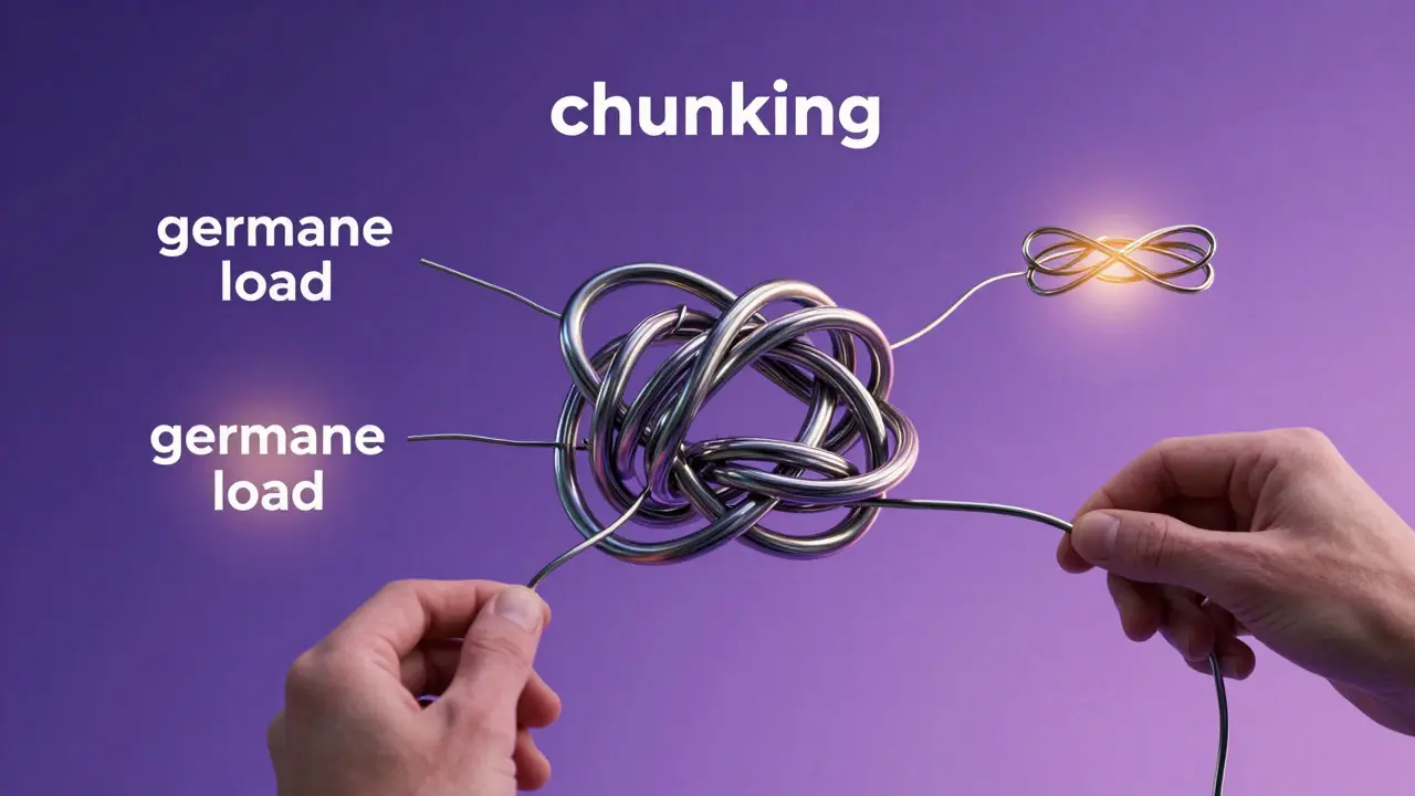
- Germane Load: This is the good stuff. It’s the mental energy spent building long-term schemas (mental structures) that help you understand new concepts. You want to maximize this, but only after minimizing extraneous load.
Here’s the trap: many designers think less is always better. But if you strip away too much context, you might lower intrinsic load so much that learners don’t engage deeply enough to build those valuable schemas. The goal is balance, not minimalism for its own sake.
Why Working Memory Is Your Bottleneck
To fix cognitive load issues, you need to respect the hardware limit: Working Memory the limited-capacity system that holds and manipulates information temporarily. Research consistently shows that adults can hold roughly four to seven items in working memory at any given time. Some newer studies suggest it might be even closer to four for complex tasks.
When you present a slide with five bullet points, each containing two sub-points, plus a diagram, and a voiceover explaining a third concept, you’ve already exceeded the capacity. The brain starts dropping information randomly. It’s not that the learner is lazy; it’s that the system is overloaded.
This limitation applies to both verbal and visual channels. Dual Coding Theory a complementary theory suggesting people remember more when information is presented in both visual and verbal formats suggests we have separate channels for text and images. However, if the text and image are redundant or contradictory, they compete for attention rather than reinforcing each other. This is known as the split-attention effect, a major culprit in poorly designed e-learning.
Identifying Red Flags in Your Current Materials
How do you know if your course is suffering from excessive cognitive load? Look for these common symptoms in your user feedback or analytics:
- High Drop-off Rates: If users quit midway through a module, check if there was a sudden spike in complexity or visual clutter right before the exit point.
- "I Didn’t Get It" Comments: Vague confusion often signals that the connection between concepts wasn’t clear because the learner was too busy processing surface-level details.
- Reliance on Rereading: If learners constantly go back to previous sections, the initial presentation likely failed to create a coherent schema.
- Visual Clutter: Count the elements on your most complex screens. If there are more than four distinct focal points, you’re asking the learner to multitask, which is cognitively expensive.
A quick audit tip: Print out your key screens or slides. Cover half of them. Can you still follow the main idea? If not, you’re relying on too many simultaneous inputs to convey a single message.
Practical Strategies to Optimize Learning Flow
Now that we’ve identified the problems, here’s how to fix them using proven techniques rooted in Multimedia Learning Principles guidelines for effective use of words and pictures in multimedia messages.
Chunking Content Effectively
Break large topics into small, manageable units. Each chunk should represent one core concept. For example, instead of teaching "The Entire Sales Process," teach "Step 1: Prospecting" separately from "Step 2: Qualification." Use progress bars or clear headings to signal these boundaries. This reduces intrinsic load by allowing the learner to focus on one schema at a time.
Eliminating Redundancy
If you have an on-screen narrator, don’t put the exact same text on the screen. This forces the learner to read while listening, which creates a bottleneck in the verbal channel. Instead, use concise keywords on screen and let the audio carry the narrative. Or, if the visual is complex, pause the audio to let the learner process the image.
Using Signaling
Guide the eye. Use arrows, highlights, or bold text to indicate what matters. This is called signaling. It reduces extraneous load by telling the learner exactly where to look, saving them the mental effort of scanning the entire page for relevant info. In video tutorials, zooming in on specific parts of a software interface is a powerful form of signaling.
Leveraging Prior Knowledge
Experts have fewer cognitive demands than novices because they have pre-existing schemas. Before diving into advanced topics, assess the learner's baseline. Use adaptive paths or optional review modules. If you assume everyone knows the basics, you create extraneous load for novices who are struggling to catch up.
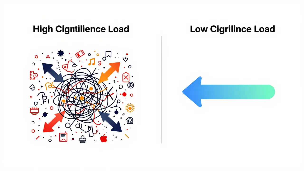
Comparison: High Load vs. Low Load Design
Let’s look at a concrete example to see the difference in practice. Imagine you’re teaching employees how to file an expense report in a new software platform.
The low-load approach doesn’t mean the lesson is simpler. It means the friction is removed. The learner spends their mental energy on *learning* the process, not on *finding* the information.
Common Pitfalls to Avoid
Even well-intentioned designers fall into traps. Here are three frequent mistakes:
- The "More is Better" Fallacy: Adding extra facts, anecdotes, or decorative graphics increases extraneous load without adding germane load. If it doesn’t help the learner achieve the objective, cut it.
- Inconsistent Terminology: Using different words for the same concept (e.g., "client," "customer," and "user" interchangeably) forces the brain to constantly map terms, increasing cognitive strain. Pick one term and stick to it.
- Ignoring the Expertise Reversal Effect: Techniques that help beginners (like step-by-step guidance) can actually hinder experts who already know the process. As learners gain proficiency, gradually remove scaffolding to allow them to apply knowledge independently.
Next Steps for Your Next Project
You don’t need to overhaul your entire curriculum overnight. Start with a single module. Apply the chunking principle. Remove one instance of redundancy. Add one signaling cue. Test it with a small group of users and watch their faces. Do they look confused? Do they ask fewer questions? Those are your metrics for success.
Cognitive Load Theory isn’t about making things easy; it’s about making things *efficient*. By respecting the limits of working memory, you free up mental space for true understanding. The result isn’t just happier learners-it’s better business outcomes, higher completion rates, and skills that actually stick.
What is the main difference between intrinsic and extraneous cognitive load?
Intrinsic load is determined by the complexity of the material itself (e.g., learning calculus vs. learning basic addition). Extraneous load is caused by how the material is presented (e.g., confusing fonts, irrelevant images, or poor layout). You cannot easily change intrinsic load without changing the topic, but you can significantly reduce extraneous load through better design.
How much information can the human working memory hold?
Research generally indicates that adults can hold approximately four to seven discrete items in working memory at one time. For complex learning tasks, the effective capacity is often closer to four. This limit applies to both verbal and visual information channels, though they operate somewhat independently.
Does reducing cognitive load mean making content simpler?
Not necessarily. Reducing cognitive load means removing unnecessary mental effort (extraneous load) so that learners can focus their energy on understanding the core concepts (germane load). The content can still be complex and challenging, but the delivery mechanism should be streamlined to avoid overwhelming the learner’s processing capacity.
What is the expertise reversal effect?
The expertise reversal effect occurs when instructional methods that are beneficial for novices become detrimental for experts. For example, step-by-step guided discovery helps beginners but can annoy experts who already know the solution. As learners gain skill, designers should gradually remove scaffolding to allow independent application of knowledge.
How can I test if my instructional design has high cognitive load?
Use observational testing with a small group of target learners. Watch for signs of confusion, such as pausing frequently, rereading sections, or asking clarifying questions about basic navigation. You can also use post-module surveys asking specifically about clarity and ease of use. If learners report feeling "overwhelmed" or "lost,
Comments
Chandan Singh
Let's be real for a second. This whole "4 to 7 items" thing is basically the old Miller's Law repackaged with some extra fluff. You're citing research that has been debated since the 2000s. Working memory capacity isn't a fixed number like RAM in a computer; it scales with expertise and domain knowledge. If you tell a chess grandmaster there are only four pieces on the board, they see patterns, not individual items. So your argument about "hardware limits" is a bit reductive. It’s more about schema formation than raw storage slots. Don’t get me wrong, the chunking advice is solid, but stop acting like we’re dealing with broken hard drives here.
Brannen Hall
Meh. I read this guide and it feels like I just paid $50 for something I could have found on a blog from 2015. Who needs all this jargon? Just say "don't clutter the screen." That’s the whole theory. Cognitive Load Theory is just a fancy name for common sense. Also, who actually reads the FAQ section at the bottom? Nobody. They just skim the headers and go back to their day jobs. The "practical guide" title is a bit of a stretch when half the page is theoretical background info that most designers already know. It’s fine, I guess, but don’t expect me to bookmark this one.
tiffany King
Ooh, I love how you broke down the three types! It makes so much sense now why my last course felt so heavy even though the content wasn't that hard. I think the extraneous load was killing me without me realizing it. Thanks for the tips on signaling too, I'm definitely going to try adding those arrows in my next video module. It really helps to have a concrete example like the expense report one. Feeling super motivated to go audit my current slides right now!
Brenna Gonedrman
Okay wait, hold up. You said less is better BUT also don't strip away context?? How do we balance that?? It sounds like a tightrope walk without a safety net. I feel like every time I cut text, I lose the nuance. And if I keep the text, I overload them. Is there a magic ratio? Or is it just vibes? Because right now it feels like I'm guessing. But yeah, the split attention thing is real. My learners always complain about reading while listening. So maybe that part is true at least. But the rest... confusing. Great post, mostly.
Courtney Wagstaff
I’ve been lurking in instructional design circles for a while and honestly, this hits the nail on the head regarding the "noise." We tend to over-decorate our materials because we think pretty equals effective. But as this piece points out, beauty can be a cognitive tax if it distracts from the core message. I recently worked on a project where we stripped out 60% of the graphics and completion rates went up by double digits. It’s wild how much mental energy people waste trying to parse irrelevant visual data. Keep these kinds of practical breakdowns coming, it’s refreshing to see someone focus on the mechanics rather than just the aesthetics.
Elisabeth Ballet
YES! Finally someone gets it! We need to stop treating learners like empty vessels and start respecting their processing power. This guide is a game-changer for teams that are stuck in the "more content = more value" trap. I’m pushing this to my whole team tomorrow. Let’s make learning efficient, not just exhaustive. Go forth and optimize your modules, everyone! 🚀
Joanna Mucha
One must consider the existential dread of the modern learner. Are we not all just vessels overflowing with the chaos of the digital age? The concept of 'germane load' is merely the soul's attempt to find meaning in the void of information. Yet, this article reduces such profound philosophical struggles to bullet points. A bold simplification. Do we truly learn, or do we merely perform the act of learning for the sake of corporate metrics? The silence between the words speaks volumes, doesn't it? Beautifully written, if a bit shallow in its spiritual depth.
Kim Edwards
DID YOU KNOW THAT IF YOU DON'T OPTIMIZE YOUR COGNITIVE LOAD YOU ARE LITERALLY WASTING BILLIONS OF DOLLARS IN CORPORATE TRAINING BUDGETS?! I mean, come on! The stats are screaming at us! I saw a study once (or was it two?) that said bad design costs companies millions. And yet, we still put five bullet points on a slide! It’s tragic! It’s a crime against humanity! We need to fix this NOW before our brains melt into a puddle of static! Wake up, sheeple!
Bonnie Watt
You guys are all missing the point. It’s not about the design, it’s about the students being lazy. If they can’t handle a little bit of text, what are they doing in higher ed? I had a professor who wrote entire paragraphs on slides and we memorized them all. Maybe the problem is that we’ve made everything too easy. Stop coddling them. Give them the full picture and let them figure it out. That’s how you build character. This guide is just another way to lower the bar.
Meagan Mueller
they want you to think it's simple but it's not. big pharma and tech corps use this to trick you into thinking you need more courses. more money. the "expertise reversal effect" is just a way to fire trainers once you learn enough. watch out. the algorithms are watching. the working memory limit is a lie to sell you apps. stay awake. 👁️👁️👁️
Dave Gibbeson
Good breakdown. One addition: don't forget the audio quality. If the narration is muffled or the pace is too fast, that adds unnecessary strain regardless of how clean the visuals are. I've seen great designs fail because the voiceover artist rushed through the script. Test the audio track separately. If you can't understand it clearly, no amount of good layout will save it. Practical tip, saves hours of debugging later.
Sabrina Newland
i think this connects to how we process language itself 🧠✨ the idea that we have separate channels for verbal and visual is fascinating. does anyone else feel like emojis help with this? like they add a visual cue to the text which might reduce load? i’ve been experimenting with adding icons to my bullet points and it seems to help retention. maybe it’s just placebo but it feels right. what do you all think about using symbols as a form of signaling? 🤔