


You spend hours designing a beautiful slide deck. You use red for warnings, green for go-ahead signals, and blue for informational notes. It looks clean. It looks professional. But when you hand it out in class, half your students are squinting. They can’t tell the difference between the text and the background. They can’t read the chart because the lines blend together. This isn’t just an inconvenience; it’s a barrier. For the roughly 8% of men and 0.5% of women who have some form of color vision deficiency (CVD), your design choices might be making learning impossible.
Accessibility in course design isn’t about being nice. It’s about ensuring that every student, regardless of their visual processing abilities, can access the same information as everyone else. When we talk about color blindness, we aren’t talking about seeing the world in grayscale. Most people with CVD see color, but they struggle to distinguish specific hues. If your course materials rely solely on color to convey meaning, you’re leaving a significant portion of your audience behind.
Understanding How Color Vision Deficiency Works
To fix the problem, you first need to understand what you’re fixing. The most common type of CVD is red-green color blindness, known technically as deuteranopia or protanopia. People with this condition often confuse reds, greens, browns, and oranges. Another less common type is blue-yellow color blindness (tritanopia). True monochromacy, where someone sees only shades of gray, is extremely rare.
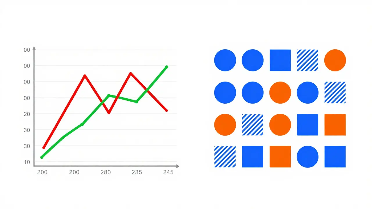
Here is the key takeaway: never use color as the sole indicator of information. If a graph has a red line and a green line, a student with red-green CVD will see two similar shades of beige. They won’t know which data set is which unless you add labels, patterns, or distinct shapes. Think about it like this: if you remove the color from your screen, does the message still make sense? If the answer is no, your design fails.
The Science of Contrast Ratios
Contrast is the difference in luminance or color that makes an object distinguishable. In web and digital course design, we measure this using a contrast ratio. The Web Content Accessibility Guidelines (WCAG) 2.1 provide the gold standard here. These guidelines, maintained by the World Wide Web Consortium (W3C), state that normal text should have a contrast ratio of at least 4.5:1 against its background. Large text (usually 18pt regular or 14pt bold) requires a minimum of 3:1.
Why does this matter? Low contrast strains the eyes. For students with low vision, cataracts, or even just reading on a bright outdoor screen, low-contrast text is unreadable. Imagine trying to read light gray text on a white background. Now imagine doing that for a three-hour lecture. Your brain works overtime to decipher the words, leaving less energy for actually understanding the content. High contrast reduces cognitive load. It lets the student focus on the idea, not the effort of reading.
Don’t guess. Use tools. There are free online contrast checkers that let you input your foreground and background hex codes. They will tell you instantly if you pass AA (standard) or AAA (enhanced) compliance. Aim for AA at a minimum. If you can hit AAA without sacrificing your brand identity, do it. It benefits everyone, not just those with disabilities.
Designing Charts and Graphs That Work for Everyone
Data visualization is a minefield for accessibility. We love colorful pie charts and bar graphs, but they are often useless to people with CVD. Here is how to redesign them effectively:
- Add Patterns and Textures: Instead of just coloring a bar green, add diagonal stripes. Instead of a solid red slice in a pie chart, use dots. This provides a visual cue that doesn’t rely on hue.
- Direct Labeling: Put the label directly on the chart element rather than relying on a legend. Legends require the user to look back and forth, matching colors mentally. Direct labeling removes that step entirely.
- Use Distinct Shapes: In scatter plots, use circles, squares, and triangles instead of just different colored dots. Shape recognition is universal and unaffected by color blindness.
- Choose Safe Palettes: Avoid red/green combinations. Blue/orange is a much safer bet. Tools like ColorBrewer offer palettes specifically designed to be colorblind-safe. They ensure that even if hues shift, the distinction remains clear.
Let’s look at a practical example. You are teaching a biology lesson about cell structures. You have a diagram with mitochondria in red and nuclei in green. To a student with deuteranopia, these look identical. Change the mitochondria to orange and the nuclei to blue. Better yet, outline each structure with a thick black border. The border defines the shape independently of the fill color.
Text Formatting and Background Choices
Your choice of font and background plays a huge role in readability. Pure black text on a pure white background creates the highest contrast, but it can cause glare and eye strain for some users, including those with dyslexia or astigmatism. A slightly off-white background (like #F5F5F5) with dark charcoal text (#333333) often feels softer while maintaining excellent contrast ratios.
Avoid justified text. Justified text creates uneven spacing between words, creating "rivers" of white space that disrupt reading flow. Left-aligned text is easier to scan. Also, keep line length reasonable. About 60-75 characters per line is ideal. Too long, and the eye loses its place. Too short, and the eye jumps too frequently.
When highlighting text, don’t just use color. Underlining is the traditional way to show links, and it still works best. Many people with low vision or cognitive differences struggle to identify hyperlinks if they are only indicated by color change. Combine color with underline or bolding. For emphasis, use bold or italics, but avoid all caps for long passages. All caps reduce word shape recognition, making reading slower and more difficult.
| Element | Non-Accessible Approach | Accessible Approach |
|---|---|---|
| Error Messages | Red text on white background | Red icon + bold text + dark background box |
| Graph Lines | Solid red and solid green lines | Dashed blue and solid orange lines with direct labels |
| Hyperlinks | Blue underlined text only | Blue underlined text + hover effect + descriptive anchor text |
| Backgrounds | Bright yellow with black text | Off-white background with dark gray text (4.5:1 ratio) |
Testing Your Materials Before Publishing
You can’t rely on your own eyes alone. Even if you have perfect color vision, you don’t know what it’s like to miss subtle cues. Use simulation tools. Browser extensions like NoISee or Stark allow you to view your website or document through various types of color blindness filters. Look at your slides. Can you still tell the difference between the categories? If not, tweak the colors.
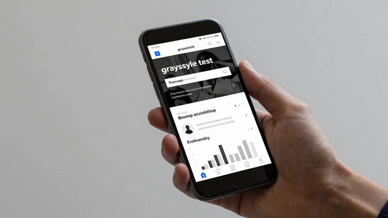
Another simple test is the grayscale trick. Convert your images and slides to black and white. If the information disappears or becomes ambiguous, you are relying too heavily on color. This method forces you to think about structure, typography, and contrast rather than hue.
Involve real users. If possible, get feedback from students with disabilities. Ask them specifically about readability and navigation. Their insights will reveal issues that automated tools miss. Automated checkers are great for catching missing alt text or low contrast, but they can’t judge if a complex diagram is logically structured for a screen reader user.
Implementing Alt Text and Screen Reader Support
Color blindness isn’t the only visual challenge. Some students are blind or have severe low vision. They use screen readers to navigate your course. If you have an image of a graph, the screen reader needs to know what’s in it. This is where alternative text (alt text) comes in.
Alt text shouldn’t just describe the image literally. It should convey the information. Don’t write "chart showing sales." Write "Bar chart showing sales increased by 20% in Q3 compared to Q2." Be concise but informative. For decorative images that add no information, use empty alt tags so the screen reader skips them. This prevents clutter for the listener.
For complex diagrams, consider providing a data table below the image. Screen readers handle tables well if they are properly coded with headers. This gives the visually impaired student the exact numbers behind the visual representation.
Building a Culture of Inclusive Design
Accessibility isn’t a checklist you complete once. It’s a mindset. Start by auditing your existing materials. Go through your past lectures, quizzes, and readings. Identify where color is used exclusively. Fix those first. Then, create templates for future work. Build slide decks with high-contrast themes and safe color palettes pre-set. Create graphic styles for charts that include patterns and labels by default.
Train your team. If you work with other instructors or designers, share these principles. Show them the contrast checker. Walk them through the grayscale test. Make accessibility part of the review process before any material goes live. When everyone buys into the idea that good design is inclusive design, the quality of the entire course improves.
Remember, designing for accessibility often results in better design for everyone. Clear headings help skimmers. High contrast helps tired eyes. Captions help people in noisy environments. By removing barriers for students with disabilities, you create a smoother, more effective learning experience for all.
What is the minimum contrast ratio required for web content?
According to WCAG 2.1 guidelines, the minimum contrast ratio for normal-sized text is 4.5:1 against the background. For large text (18pt or 14pt bold), the minimum ratio is 3:1. Meeting these standards ensures readability for users with low vision and color blindness.
How can I make graphs accessible to colorblind students?
Avoid using color alone to distinguish data points. Use different shapes (circles, squares), patterns (stripes, dots), and direct labeling on the chart elements. Choose color palettes that are distinct in both hue and brightness, such as blue and orange, rather than red and green.
Is blue text on a white background accessible?
Standard blue text (like #0000FF) on a white background often fails contrast requirements. It usually has a ratio of around 8.5:1, which passes, but lighter blues often fail. Always check your specific shade with a contrast checker. Dark navy blue is generally safer than bright royal blue.
Do I need alt text for every image in my course?
Yes, but the content varies. Informative images need descriptive alt text that conveys the same information as the visual. Decorative images should have empty alt attributes so screen readers skip them. Complex charts may need both brief alt text and a longer detailed description nearby.
What tools can I use to check for color blindness compatibility?
You can use browser extensions like NoISee or Stark to simulate various types of color vision deficiency. Online tools like Color Oracle also provide real-time simulation. Additionally, converting your design to grayscale is a quick manual test to ensure information is not lost without color.