Most developers know how to write code. But too many struggle when it comes to showing what that code actually does. If you’ve ever handed a teammate a CSV file and said, "Figure it out," you know the problem. Data visualization isn’t just for analysts or designers-it’s a core skill for developers who want their work to be understood, trusted, and used.
Why Developers Need Data Visualization
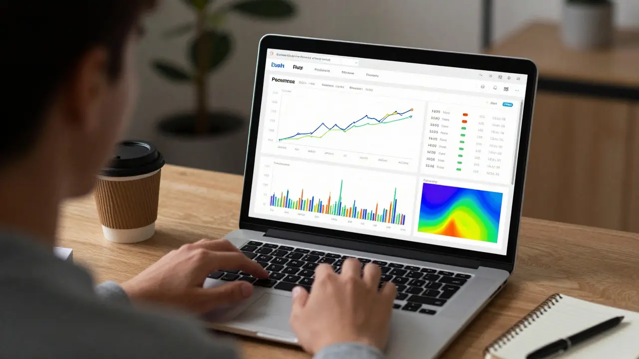
You build a machine learning model that predicts customer churn. It’s accurate. It runs fast. But your product manager can’t tell if it’s working without staring at a table of numbers. That’s where visualization fails you-not because the code is bad, but because the output isn’t human-readable.
Studies show that people process visual information 60,000 times faster than text. That’s not a myth. It’s neuroscience. When you turn metrics into charts, you turn confusion into clarity. For developers, this means faster feedback, better collaboration, and fewer "why isn’t this working?" meetings.
Real-world example: A team at a New Zealand fintech startup built a fraud detection system. Their initial dashboard showed raw logs. The compliance team rejected it. After adding a time-series heatmap of transaction spikes and a pie chart of fraud categories, approval time dropped from 3 days to 4 hours.
Best Tools for Developers
You don’t need to become a designer. You need tools that fit into your workflow. Here are the ones most developers actually use in 2025.
- Plotly (Python/JavaScript) - Lets you build interactive charts with minimal code. Works in Jupyter notebooks, web apps, and dashboards. The
plotly.expresslibrary lets you make a line chart with one line:px.line(df, x='date', y='sales'). - Matplotlib - The old reliable. Still the default for academic papers and internal reports. It’s verbose, but if you need pixel-perfect control, it’s your go-to.
- Altair - Declarative. You describe what you want, not how to draw it. Built on Vega-Lite. Great if you hate managing axes and colors manually.
- D3.js - The king of custom visuals. If you need a sankey diagram of API call flows or a radial tree of dependency graphs, D3 is the only option. Steep learning curve, but unmatched flexibility.
- Streamlit - Turns Python scripts into web apps in minutes. Perfect for sharing internal dashboards. No HTML, no CSS, just Python. Used by teams at Xero and ANZ Bank for quick prototyping.
Most developers start with Plotly or Streamlit. They switch to D3 only when they need something truly custom. That’s the right path.
Course Projects That Actually Matter
Not all course projects are created equal. If your project just plots random data from a CSV, you’re wasting time. Here are five real-world project ideas that build skills employers care about.
- Real-time API Monitoring Dashboard - Pull data from a public API (like GitHub or Twitter) and show response times, error rates, and traffic spikes over time. Use Streamlit or Plotly Dash. Add alerts when latency crosses a threshold.
- Database Query Performance Visualizer - Log slow SQL queries from your app. Plot query duration vs. frequency. Color-code by table. Bonus: show how indexing changed performance.
- Deployment Frequency vs. Failure Rate - Use your CI/CD logs. Plot how often you deploy vs. how often things break. This is the core metric of DevOps teams. If your deployment rate goes up but failure rate stays flat, you’re improving.
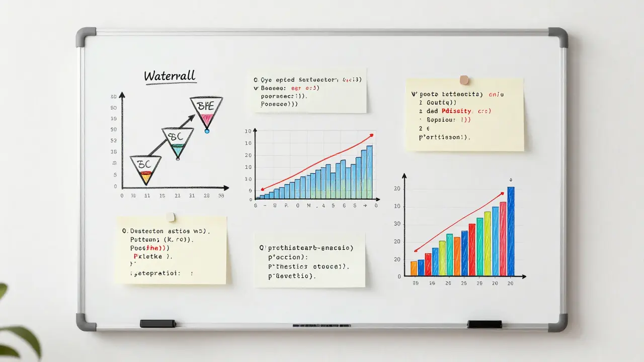
- User Behavior Funnel - Track how users move through your app. Start with sign-up, then feature A, then feature B. Show drop-off rates. Use a waterfall chart. This is what product teams live for.
- Network Traffic Anomaly Detector - Simulate network logs. Use clustering (like DBSCAN) to find outliers. Visualize normal vs. suspicious traffic patterns. This is how security teams catch breaches early.
Each of these projects teaches you more than how to make a bar chart. They teach you how to ask the right questions, clean messy data, and communicate findings to non-technical people.
Common Mistakes Developers Make
Even experienced coders mess this up. Here are the top three mistakes I’ve seen in team codebases.
- Using pie charts for more than 4 categories - Your brain can’t compare slice sizes accurately. Use a bar chart instead. Always.
- Coloring everything - If every line is a different color, you’re not helping. Use color to highlight one key trend. Keep the rest grayscale.
- Ignoring accessibility - 8% of men have red-green colorblindness. If your chart relies on red vs. green to show success vs. failure, half your audience is lost. Use patterns, labels, or blue/orange instead.
One developer I worked with spent two weeks debugging a "bug" in his visualization. Turns out, he was using red for "good" and green for "bad." His colorblind teammate thought the system was failing constantly. He fixed it in 10 minutes by switching to green and gray.

How to Learn This Without Another Course
You don’t need to enroll in a $2,000 course. Start here:
- Take one of your existing scripts and turn its output into a chart. Use Plotly or Matplotlib.
- Find a public dataset (Kaggle, data.gov.nz, or GitHub’s public datasets) and ask yourself: "What story does this tell?"
- Build one of the projects above in a weekend. Share it on GitHub. Ask for feedback.
- Study visualizations from The New York Times or FiveThirtyEight. Not to copy them-but to understand how they guide the eye.
There’s a myth that data visualization is about art. It’s not. It’s about clarity. It’s about removing friction between your code and the people who need to use it.
What Comes Next
Once you’re comfortable with static charts, move to interactive dashboards. Learn how to connect them to live data. Then, learn how to embed them in your apps. That’s where the real value is.
Developers who can visualize data don’t just write code. They influence decisions. They answer questions before they’re asked. They turn data into action.
Do I need to know statistics to do data visualization?
No, not at first. You can make useful charts with basic understanding-knowing what a line chart shows vs. a histogram, or when to use a scatter plot. But as you go deeper, stats become essential. Learn mean, median, standard deviation, and correlation. You don’t need to run regressions yourself, but you need to know what they mean when someone else does.
Which tool is best for beginners?
Start with Plotly in Python. It’s intuitive, works in Jupyter notebooks, and generates interactive charts with almost no configuration. If you’re building web apps, try Streamlit. It turns Python scripts into shareable dashboards in minutes. Both have excellent documentation and large communities.
Can I use Excel for data visualization as a developer?
Only for quick, one-off checks. Excel is fine for debugging a small dataset. But if you’re automating reports, sharing results with a team, or embedding visuals in an app, Excel breaks down. It’s not version-controlled. It’s not reproducible. And it doesn’t scale. Use Python tools instead.
How do I know if my visualization is good?
Ask someone who doesn’t know your project to look at it for 10 seconds. Can they tell you the main takeaway? If yes, it’s good. If they need to read the axis labels, zoom in, or ask what the colors mean, it’s not. Good visualizations communicate instantly.
Is D3.js worth learning today?
Only if you need something no other tool can do. Most dashboards can be built with Plotly, Altair, or even Chart.js. D3 is powerful, but it’s like using a lathe to hammer a nail. Learn it if you’re building custom animations, complex networks, or interactive maps. Otherwise, stick to higher-level tools.
Comments
Emmanuel Sadi
Wow another ‘developers need viz’ article. Congrats, you just reinvented the wheel. Everyone who’s ever touched pandas knows this. Why are we still wasting bandwidth on this?
Nicholas Carpenter
I actually found this super helpful. I’ve been stuck using Excel for dashboards at work and it’s a nightmare. Plotly and Streamlit changed everything for my team. No more ‘send me the CSV’ emails.
Thanks for the real-world examples - the fraud detection one hit home. We had the exact same issue last quarter.
Chuck Doland
The assertion that data visualization is a core competency for developers is not merely defensible - it is epistemologically necessary. The cognitive load imposed by tabular data exceeds human perceptual bandwidth, as evidenced by the seminal work of Tufte and later corroborated by cognitive neuroscience literature.
Moreover, the pedagogical efficacy of the proposed course projects is unimpeachable. The real-time API monitoring dashboard, in particular, integrates principles of observability, statistical process control, and human-computer interaction into a single, cohesive learning artifact. One might even argue that this constitutes a proto-DevOps curriculum.
Madeline VanHorn
Plotly? Streamlit? Please. If you’re using those, you’re not a developer. You’re a copy-paste coder who doesn’t even know what SVG is.
Real devs use D3. Everything else is just glitter on a dumpster.
Glenn Celaya
everyone says plotly is easy but its not its just confusing and the docs are trash
i spent 3 days trying to get a simple line chart to not look like a toddler drew it
now i just screenshot excel and call it a day
Wilda Mcgee
Y’all are overcomplicating this. Visualization isn’t about tools - it’s about empathy. If your chart makes someone say ‘huh?’ instead of ‘ohhh!’ then you’re not helping.
Start small. Take your script that logs API calls. Turn it into a line chart. Share it with your PM. Watch their face light up when they finally get it without asking 12 questions.
That’s the win. Not the tool. Not the color scheme. Just clarity.
Also - yes, use blue and orange. Red/green is a crime against humanity. I’ve had coworkers cry over this.
Chris Atkins
Been doing this for 10 years and I still forget about accessibility
Just switched my alerts from red/green to blue/gray and my teammate finally stopped thinking the system was broken
thanks for the reminder
amber hopman
Wait so you’re saying I don’t need to learn statistics to make charts? That’s literally the only reason I avoided this whole thing.
Now I’m gonna try Plotly this weekend. Maybe I’ll stop looking like an idiot in standups.
Jim Sonntag
D3 is like using a flamethrower to light a candle. But hey if you wanna spend 6 months learning how to make a circle move in a spiral while singing the national anthem then go ahead.
I’ll be over here using Plotly and actually shipping stuff.
Deepak Sungra
Why are we even talking about tools? No one cares if your chart looks good. What matters is if the boss likes it. I had a guy spend 2 weeks making a beautiful dashboard and the CEO said ‘can you make the red bigger?’ and that was it.
So just use Excel. At least you get paid for it.
Samar Omar
Oh wow. Another Western-centric guide. Did you forget that most developers in the world don’t even have access to Python environments? In India, we’re still stuck with Excel 2007 on Windows XP machines because the company won’t upgrade. Your ‘Streamlit’ dreams are laughable. What you call ‘best practices’ is just tech privilege dressed up as advice.
And don’t get me started on ‘five real-world projects’ - most of us are fixing legacy COBOL systems that don’t even have APIs. Your ‘GitHub datasets’ are irrelevant to our reality. This isn’t a tutorial. It’s a fantasy.
chioma okwara
you spelled ‘visualization’ wrong in the title. its not ‘viz’ its ‘visualisation’ with an s. also ‘Jupyter’ is capitalized wrong. this whole thing is a joke.
John Fox
Plotly is fine. I use it. Sometimes I forget to set the theme and it looks like a rainbow threw up. But hey it works.
Also I made a funnel chart last week and my manager cried. Not because it was pretty. Because he finally understood why users were dropping off.
Tasha Hernandez
Everyone’s so obsessed with tools. But nobody talks about the real problem: the people who demand charts but refuse to learn what they mean.
I built a beautiful anomaly detector. Showed it to the security team. They asked ‘why is the red line higher than the green one?’
I said ‘because red means threat.’
They said ‘but green is good right?’
I quit. I’m going back to writing APIs that nobody sees.
Emmanuel Sadi
Wow. So you’re telling me that after all this, the answer is still ‘use Excel’? I’m shocked. Absolutely shocked.
Next you’ll say we should use chalkboards for CI/CD logs.