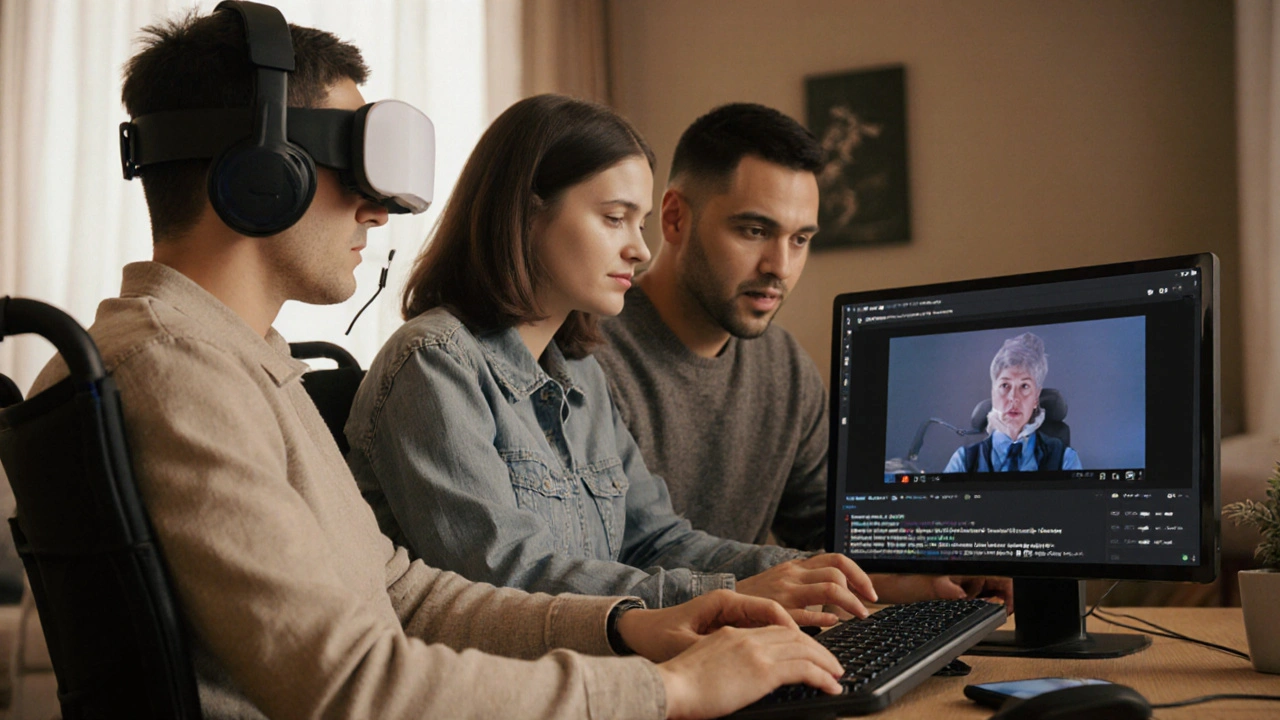
More than 1 in 5 adults in New Zealand live with a disability. That’s not a small group. It’s millions of people who want to learn, grow, and advance their lives through online courses-but too often, the courses they find aren’t built for them. If you’re designing online learning, ignoring accessibility isn’t just unfair-it’s leaving out a huge part of your audience. And it’s not as hard as you think to fix.
Start with the basics: what accessibility really means
Accessibility isn’t about adding a few extra buttons or turning on captions after the fact. It’s about building from the ground up so anyone can use your course, no matter how they see, hear, move, or process information. That means text that screen readers can read out loud, videos with accurate captions and transcripts, buttons you can navigate with a keyboard, and color schemes that don’t blind people with low vision.
Think about it: if your course uses a light gray text on a white background, someone with low vision won’t be able to read it. If your quiz requires clicking tiny checkboxes with a mouse, someone with limited hand mobility can’t complete it. If your lecture video has no captions, a deaf learner is left out. These aren’t edge cases-they’re common barriers.
Build content that works for everyone
Start with your text. Use clear, simple language. Avoid jargon. Break long paragraphs into short ones. Use headings to organize ideas-not just for looks, but so screen readers can jump between sections. A learner using a screen reader should be able to hear your course structure: Introduction → Module 1 → Key Points → Practice Activity.
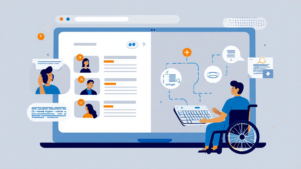
For images, always add alt text. Not just "image of a person learning," but "woman with hearing aids watching a video with captions on a tablet." Specificity helps. If an image is decorative-like a background pattern-mark it as such. Screen readers should skip it.
PDFs are a trap. They’re often scanned images with no text layer. If you must use them, run them through an accessibility checker first. Better yet, use HTML pages. They’re easier to make accessible, load faster, and work on any device.
Make videos and audio truly accessible
Captions aren’t optional. They’re required. But not all captions are equal. Auto-generated captions from YouTube or Zoom? They’re often wrong-names, technical terms, even basic words get mixed up. A misspelled word like "cancer" instead of "canter" in a medical course? That’s dangerous.
Use professional captioning services or take the time to write and sync your own. Include speaker identification: "Instructor: This formula calculates..." and describe important non-speech sounds: "[door slams]", "[keyboard typing rapidly]". This helps people who are deaf or hard of hearing understand context.
For audio-only content-like podcasts or lectures-always provide a full transcript. Not a summary. A full word-for-word version. That way, someone who’s deaf, or who prefers reading, or who’s in a noisy environment, can follow along exactly.
Design for movement and motor challenges
Not everyone can use a mouse. Some learners rely on keyboards, voice commands, or switch devices. That means your course must work without a mouse.
Test your course by unplugging your mouse and using only the Tab key. Can you get to every button, link, and form field? Can you activate them with Enter or Space? If you get stuck, your course isn’t accessible.
Buttons should be big enough to tap on a phone. At least 44 by 44 pixels. Don’t put links right next to each other if they’re small-that’s a nightmare for someone with tremors. Leave space. Use clear labels: "Submit Assignment" instead of "Click here."
Don’t rely on color alone to convey meaning. If you say, "Incorrect answers are in red," someone who’s colorblind won’t know which ones are wrong. Add icons or text labels too: "Incorrect: Need to review".
Support cognitive diversity
Some learners have dyslexia, ADHD, autism, or memory challenges. They need structure, clarity, and control.
Give learners options. Let them slow down video playback. Let them turn off animations. Let them choose between text, audio, or video versions of the same content. Offer downloadable worksheets so they can study offline.
Break lessons into small chunks. Ten-minute videos are better than hour-long lectures. Use consistent layouts across modules. If the navigation changes every week, it’s confusing. Stick to one pattern.
Avoid flashing content. Even a 3-times-per-second flash can trigger seizures. If you need motion, make it subtle. And always let users turn animations off.
Test with real users
You can read all the guidelines in the world, but nothing beats testing with people who actually live with disabilities. Don’t just ask a friend with glasses if the font is big enough. Find learners with physical, sensory, or cognitive disabilities and invite them to use your course.
Set up a simple feedback loop: "What was hard? What got in your way? What helped?" You’ll hear things you never expected. Maybe the audio description is too fast. Maybe the quiz buttons are too close. Maybe the course feels overwhelming because there’s no way to pause and reflect.
Don’t wait until launch to test. Start early. Build a small prototype. Test it. Fix it. Test again. Accessibility isn’t a checklist you complete once-it’s a habit.
Use tools that help, not hurt
There are free tools that make this easier. WAVE (Web Accessibility Evaluation Tool) scans your website and highlights problems. Axe is another one, built into browser dev tools. Both are free and work in Chrome and Firefox.
For captions, try Otter.ai or Rev.com for accurate transcription. For alt text, use AI tools like Microsoft’s Seeing AI to suggest descriptions, then edit them yourself for accuracy.
And don’t forget: your Learning Management System (LMS) matters. Not all platforms are created equal. Canvas, Moodle, and Blackboard have accessibility features-but you have to turn them on and use them right. Check your LMS’s accessibility statement. If it doesn’t have one, it’s not ready for inclusive design.
Legal and ethical reasons to act now
In New Zealand, the Human Rights Act and the Disability Act require reasonable accommodations in education. That includes online courses. Ignoring accessibility could put your institution at legal risk.
But beyond the law, it’s the right thing to do. Learning is a human right. When you design for accessibility, you’re not just following rules-you’re opening doors. Someone with a disability might finally finish a course that helps them get a job. Or start a business. Or just feel less alone.
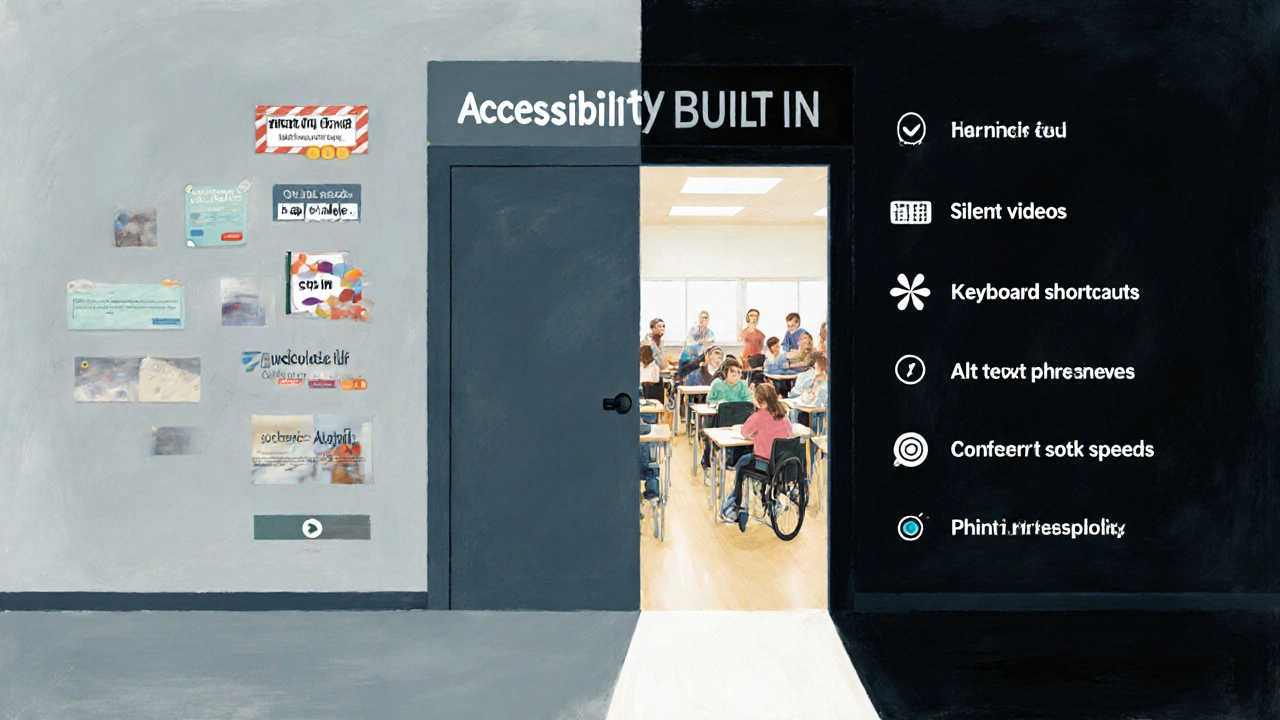
There’s no such thing as "too late" to fix accessibility. Start with one module. Fix the captions. Add alt text. Make buttons bigger. Then move to the next. Progress, not perfection, is the goal.
What happens when you get it right
When you design for accessibility, you don’t just help people with disabilities. You help everyone.
Someone studying on their phone in a bright park? Better contrast helps them. Someone watching a video in a quiet library? Captions let them learn without sound. Someone with a broken arm? Keyboard navigation saves them. A parent juggling kids and a course? Clear structure makes it possible.
Accessible design isn’t a side project. It’s better design. And the data backs it up: courses with accessibility features have higher completion rates, better engagement, and fewer support requests.
There’s no excuse anymore. The tools are free. The standards are clear. The people are waiting.
Do I need to make my entire course accessible if only one learner has a disability?
Yes. Accessibility isn’t about accommodating one person-it’s about building a system that works for everyone. Even if only one learner currently needs it, you’re creating a course that will serve future learners too. Plus, accessibility benefits all users-like captions helping people in noisy environments or clear headings helping anyone skimming content.
Is it expensive to make online courses accessible?
It doesn’t have to be. Many accessibility fixes cost nothing: adding alt text, using proper headings, choosing high-contrast colors. Paid services like captioning or transcription can add cost, but many free tools (like Otter.ai or WAVE) do a lot of the work. The real cost is ignoring it-lost learners, lower completion rates, and potential legal issues.
What’s the most common mistake in accessible course design?
The biggest mistake is treating accessibility as an afterthought. People design a course, then try to "add" accessibility at the end-like slapping on captions or alt text last minute. That’s inefficient and often incomplete. Accessibility works best when it’s built in from day one, not patched on later.
Can I use templates to make accessible courses?
Yes-but only if the template itself is accessible. Many commercial templates look nice but have poor contrast, hidden keyboard traps, or non-descriptive links. Always test any template before using it. Look for ones labeled as WCAG 2.1 AA compliant. If the vendor doesn’t say it’s accessible, assume it’s not.
How do I know if my course meets accessibility standards?
Use free tools like WAVE or Axe to scan your course. Check for missing alt text, low contrast, keyboard traps, and unlabelled form fields. Then, test with real users who have disabilities. Standards like WCAG 2.1 AA are the global benchmark. If your course passes both automated tests and real-user feedback, you’re on solid ground.
Comments
kelvin kind
Just made my first module accessible last week. Took me two hours. No fancy tools. Just alt text, proper headings, and turned off auto-play. Learners are actually finishing it now. Weird, right?
Ian Cassidy
WCAG 2.1 AA compliance isn't optional-it's a foundational UX principle. If your LMS doesn't support semantic HTML, ARIA labels, and keyboard navigation out of the box, you're technically violating the ADA and the UNCRPD. Stop treating accessibility as a plugin.
Zach Beggs
Love this. We rolled out alt text training for all our instructors last quarter. No pushback. Everyone got it. Turns out, good design just... works better for everyone.
Kenny Stockman
Been there. Used to think accessibility was just for ‘those people.’ Then my cousin with cerebral palsy tried to take a course I built. Couldn’t click anything. Felt like trash. Now I test everything with a keyboard. No mouse allowed. Changed everything.
Antonio Hunter
It’s worth noting that cognitive accessibility often gets overlooked in favor of visual or motor accommodations. The cognitive load of inconsistent navigation, ambiguous button labels, and unstructured content can be paralyzing for learners with executive function challenges. A predictable, repetitive interface isn’t boring-it’s essential. And don’t forget: reading level matters. A 10th-grade reading level is the sweet spot for maximum comprehension across neurodiverse populations. Anything above that requires scaffolding, not just ‘simpler words.’
Paritosh Bhagat
Wow. So you're saying we should actually *care*? I mean, really? People with disabilities shouldn't be expected to adapt to the system? How revolutionary. Also, your grammar is kinda sloppy. It's 'it's' not 'its' in 'it's not as hard as you think'. Just saying. 😅
Ben De Keersmaecker
Minor nitpick: ‘[door slams]’ should be italicized in transcripts per standard captioning conventions. Also, ‘[keyboard typing rapidly]’-is that really necessary? Unless the typing is part of the instructional content, it’s extraneous noise. Precision matters.
Aaron Elliott
One might argue that the entire premise is a form of performative altruism. The market will naturally optimize for accessibility when it becomes profitable. Until then, mandating it is just bureaucratic overreach dressed in moral language. Besides, isn't life inherently inaccessible? Why should education be any different?
Chris Heffron
Love this! 😊 Made a video last week with captions and a transcript. Got a message from a grandma in Nebraska who said she finally understood her grandson's online class. Tears. Seriously. 🥹
Adrienne Temple
When I started adding alt text, I thought it was just for screen readers. Then I realized my students were using it to search for images in Google. One kid found the exact diagram he needed for his project because I wrote ‘graph showing oxygen levels vs. altitude with labeled peaks’. That’s power. 😊
Sandy Dog
OMG I CRIED. Like, full-on ugly cry. I have dyslexia and ADHD and every course I've ever taken made me feel like a failure. This? This feels like someone finally looked me in the eye and said, 'You belong here.' I'm not just a statistic. I'm a learner. And now? I'm finishing my certificate. Thank you. 🥺😭💖
Nick Rios
My sister uses a head pointer to navigate. She can’t use a mouse. I showed her one of our old courses. She got stuck on a dropdown menu that only opened on hover. Took us 20 minutes to figure out why she couldn’t proceed. We fixed it. Now she’s taking her first college course. It’s not about being perfect. It’s about not giving up.
Amanda Harkins
It’s funny how we call it ‘accessibility’ like it’s some extra feature. But really, it’s just good design. If your course is hard to use, it’s not the learner’s fault. It’s yours. And yeah, it’s easier to ignore. But easier isn’t right.
Kenny Stockman
^^^ This. I used to think ‘inclusive design’ was just a buzzword. Then I saw my 70-year-old uncle, who lost his vision after a stroke, use my course with VoiceOver. He laughed when he heard ‘woman with hearing aids watching a video with captions on a tablet.’ Said it was the first time a description felt human. That’s the goal.