Most people think editorial design is just about making things look pretty. It’s not. It’s about guiding the reader’s eye, making complex information easy to follow, and keeping someone hooked on a 10-page article without them realizing they’ve spent 20 minutes reading. If you’ve ever flipped through The New Yorker, Wired, or even a well-designed magazine at your local café and thought, How do they make this so easy to read? - you’re looking at editorial design in action.
Why Grids Are the Hidden Backbone of Every Great Publication
Grids aren’t just lines on a page. They’re the invisible architecture that holds everything together. Think of them like the steel frame of a building. You don’t see it, but if it’s missing, the whole thing collapses.
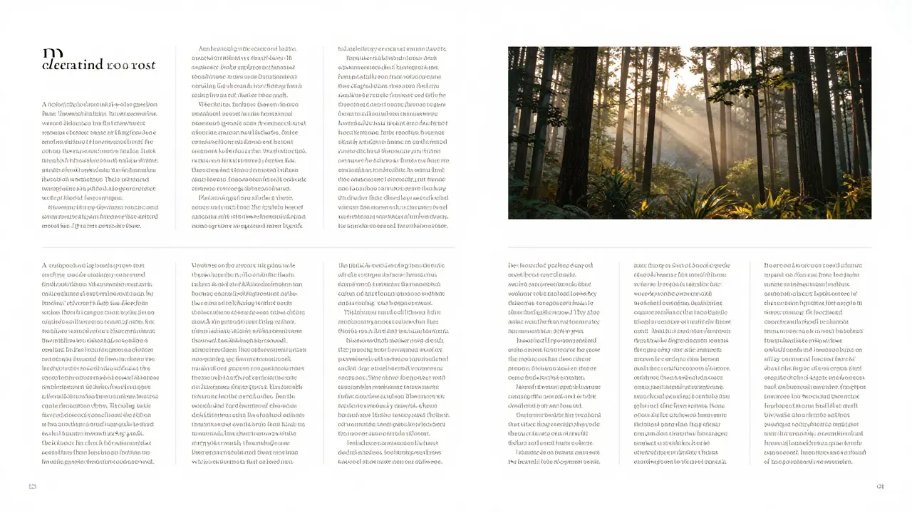
A 12-column grid is the most common in editorial design. Why? Because it’s flexible. You can split it into two, three, or four columns. You can let an image stretch across six columns while text flows neatly beside it. The grid doesn’t force you into rigid boxes - it gives you structure so you can break rules intentionally.
Take Monocle magazine. Their layout uses a 12-column grid, but they rarely use all 12 at once. Sometimes, a single paragraph stretches across eight columns to create a sense of calm. Other times, they break the grid with a full-bleed photo that feels like it’s bursting out of the page. That’s not chaos. That’s control.
Start with a simple 4-column grid when you’re learning. Set margins of 1 inch on all sides. Use a 0.5-inch gutter between columns. This gives you breathing room. Too tight, and your layout feels claustrophobic. Too loose, and it loses rhythm.
Visual Hierarchy: How to Make Readers Look Where You Want
Every reader’s eye follows a path. You can’t control where they start, but you can guide them. That’s visual hierarchy.
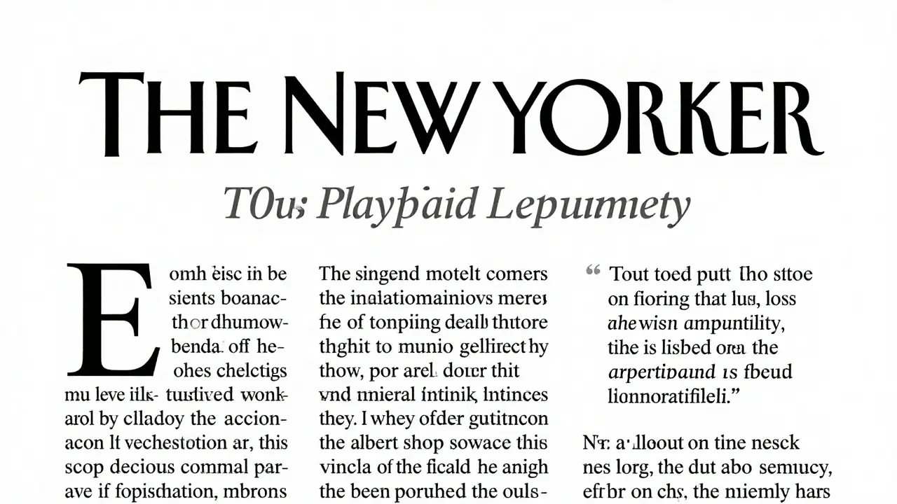
It’s not about making the headline bigger. It’s about using contrast. Size, weight, color, spacing - all of these work together to tell the reader: This matters more.
Here’s a real example from a feature in Atlantic: The headline is set in a bold, serif font at 36pt. The subhead is 20pt, italic, and in a darker gray. The first paragraph starts with a drop cap - a large initial letter that draws the eye down. The body text is 11pt, with a line height of 1.6. No bold. No italics. Just clean, consistent rhythm.
What’s missing? Color. No neon highlights. No underlines. No boxes around quotes. Why? Because too many visual signals create noise. Your reader’s brain gets tired. They stop reading.
Use hierarchy like a flashlight. Shine it on the most important line. Let the rest fade into the background. If you’re designing a long-form article, the first 30 words are your most important. They need to pull the reader in. The headline, subhead, and opening paragraph should feel like one unit - connected, clear, and compelling.
Long-Form Layouts: When the Story Needs Space to Breathe
Long-form isn’t just a long article. It’s a journey. And like any journey, it needs pacing. A 5,000-word story shouldn’t feel like a wall of text. It should feel like walking through a museum - each room reveals something new.
Break it up. Use pull quotes. Use sidebars. Use images that don’t just illustrate - they add context. A sidebar with a timeline, a map, or a quick statistic can reset the reader’s attention without breaking the flow.
One of the best long-form layouts I’ve seen was in ProPublica’s investigation on housing inequality. They didn’t use flashy animations. They used spacing. White space between sections. A single, centered image after every 800 words. A subtle gray line to separate each chapter. The reader could pause. Breathe. Reflect.
Here’s what to avoid: stuffing every inch of the page. Don’t put text next to every image. Don’t force captions under every photo. Let some elements breathe. A single image with 2 inches of space above and below it can be more powerful than three images crammed together.
Use page breaks like chapter breaks. In print, each new section starts on a new right-hand page. In digital, you can scroll, but the rhythm still matters. Every 1,000 words, give the reader a visual reset.
Typeface Choices That Last
Font choice isn’t about what looks cool. It’s about readability over time. A headline might look amazing in a bold, decorative font. But if the body text is set in something too thin or too quirky, readers will abandon you.
For editorial design, stick to two typefaces max. One for headlines. One for body. Always. The best pairings are classic: Georgia for body, Playfair Display for headlines. Or Merriweather with Lora. Both are free, highly legible, and built for long reading.
Never use more than three weights. Bold, regular, and italic are enough. Add light or extra bold only if you have a very specific reason - like highlighting a statistic.
Line length matters. Too short, and your eye jumps back and forth like a ping-pong ball. Too long, and you lose your place. The sweet spot? 55 to 75 characters per line. That’s about 8 to 10 words. Test it. Copy a paragraph into a text editor. Adjust the width until it feels comfortable.
How to Build Your Own Editorial System
You don’t need to be a designer to create a strong editorial layout. You need a system.
Start with a style guide - even a simple one. Write down:
- Font pairings (headlines and body)
- Grid layout (columns, margins, gutters)
- Headline sizes (H1, H2, H3)
- Line height for body text
- How to handle images and captions
- How to format pull quotes
Then stick to it. Every article you design should feel like it came from the same publication. Consistency builds trust. Readers know what to expect. That’s how you keep them coming back.
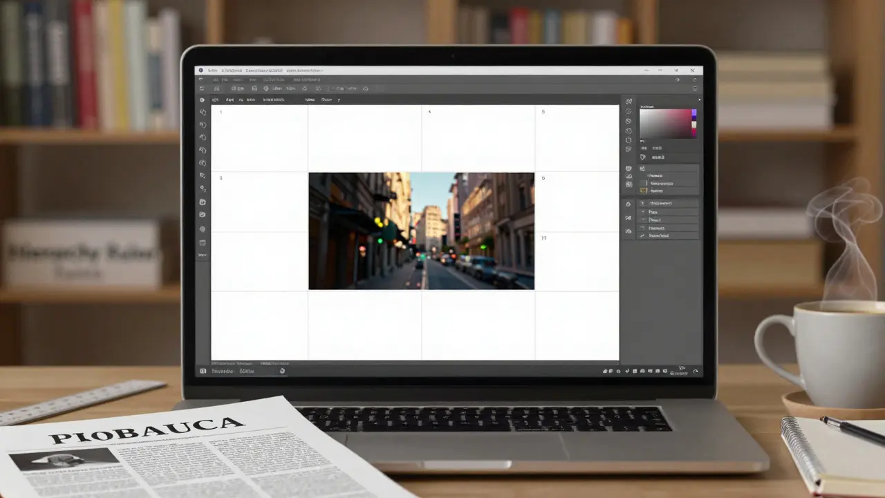
Use templates. In Adobe InDesign, create a master page with your grid, margins, and header/footer. In Figma, build a frame with preset spacing. Don’t start from scratch every time. That’s not creativity - that’s wasted energy.
Common Mistakes (And How to Fix Them)
Here are the top three mistakes I see in amateur editorial layouts:
- Too many fonts. Fix: Stick to two. One serif, one sans-serif. That’s it.
- Uneven spacing. Fix: Use consistent margins. Measure everything. If your image has 1 inch above it, make sure every other image does too.
- No visual rhythm. Fix: Alternate between text-heavy and image-heavy spreads. Let the reader rest. Don’t bombard them.
Another big one: ignoring the reader’s journey. If your article is about climate change, and the first image is a photo of a forest fire, but the next three pages are dense statistics - you’ve lost them. Start with emotion. Then give them facts. That’s the arc.
What Good Editorial Design Looks Like in Practice
Look at The New York Times’s 500 Words series. Each piece is under 1,000 words. But the layout? It’s flawless. Headlines are bold, centered, and spaced generously. Body text is narrow. Images are large, quiet, and placed with purpose. Pull quotes are set in a slightly larger serif font, italicized, and indented. No color. No icons. No borders.
It’s not fancy. It’s quiet. And that’s the point. The design doesn’t shout. It whispers. And that’s how you get people to lean in.
Try this: Open a PDF of a long-form article. Turn off the color. Now look at just the shapes. Where are the big blocks? Where are the gaps? What’s the rhythm? That’s the real design. Not the colors. Not the fonts. The space between.
Do I need to know Adobe InDesign to do editorial design?
No. While InDesign is the industry standard, you can create excellent editorial layouts in Figma, Canva, or even Google Docs with careful formatting. The tools matter less than your understanding of grids, hierarchy, and spacing. Start with free tools. Learn the principles first. Upgrade your software later.
Can editorial design work for websites?
Absolutely. Long-form journalism websites like The Guardian’s long reads or Wired’s narrative features use the same principles: clear grids, consistent typography, strategic white space, and visual breaks. The only difference? You’re designing for scrolling, not turning pages. But the rules of rhythm and hierarchy stay the same.
How long does it take to get good at editorial design?
You’ll see improvement after your first 10 layouts. Real mastery takes 50-100 projects. The key isn’t talent - it’s repetition. Analyze one great layout a week. Try to replicate it. Then break it. Then rebuild it your way. That’s how you learn.
Is editorial design only for magazines?
No. It’s used in annual reports, research papers, newsletters, eBooks, and even app onboarding flows. Any time someone needs to read and understand complex information over time, editorial design applies. Think of it as visual storytelling for the mind.
What’s the most important skill in editorial design?
Patience. Not the kind you wait for. The kind you build. It’s the patience to test 10 different grid layouts. The patience to adjust kerning on a headline. The patience to leave space empty because it feels right. Editorial design is slow work. And that’s what makes it powerful.
If you’re serious about mastering this, start small. Redesign one article from your favorite publication. Just one. Use the same text. Change the layout. Compare. Then do it again. In six months, you’ll look at any magazine or website and see the grid beneath it. And you’ll know - you’re not just reading. You’re seeing.
Comments
Tiffany Ho
I just tried redesigning a newsletter layout using the 4-column grid they mentioned and wow it changed everything
Used to cram everything in and thought it looked busy but now with just a little breathing room it feels so much more professional
Also stopped using three fonts like I used to and stuck to Georgia and Playfair - no one ever noticed but my readers kept saying they could read it easier
Small changes really do add up
michael Melanson
Grids are the silent heroes of design
lucia burton
Let me tell you something - editorial design isn't just about aesthetics, it's cognitive ergonomics
When you nail the hierarchy, you're not just arranging text, you're sculpting attention
The human brain operates on predictive patterns, and a well-structured grid taps into that neural architecture
That's why Monocle works - they're not designing for beauty, they're designing for retention
Every column, every gutter, every white space is a micro-decision that reduces cognitive load
And if you're not measuring line length at 55–75 characters, you're accidentally designing for skimmers, not readers
Don't get me started on the myth that 'more visuals = more engagement' - no, it's about strategic pauses
ProPublica didn't use flashy transitions, they used rhythm
Each image isn't decoration, it's a reset button for working memory
And let's talk about typefaces - Georgia isn't just a font, it's a behavioral nudge
Its x-height and contrast are calibrated for sustained reading
That's why you don't see a single decorative font in The New York Times' 500 Words
They're not afraid of minimalism - they weaponize it
Design isn't about what you add - it's about what you remove
Denise Young
Oh honey, you think you're being subtle with your 12-column grid
But let me guess - you also think 'white space' means leaving a whole inch of nothing
Newsflash: if your reader has to pause and wonder why there's a gap, you failed
True white space doesn't announce itself - it just feels right
And don't even get me started on people who use three weights of one font like it's a fashion show
It's not a wardrobe - it's a sentence
Also, anyone who says 'I don't need InDesign' is either lying or has never tried to align a drop cap properly in Google Docs
It's like saying you don't need a wrench because you can tighten a bolt with your teeth
Tools don't make you a designer - but ignorance of them sure makes you look like a toddler with crayons
But hey, at least you tried
Sam Rittenhouse
I remember when I first tried to design a long-form piece and just threw everything on the page
It looked like a toddler’s art project after a sugar rush
Then I spent a week just copying The New Yorker’s layout - not changing a single word, just rebuilding the structure
And when I showed it to my editor, she said 'This feels like breathing'
That’s when it clicked
Design isn’t about making things look cool
It’s about making people feel safe enough to stay
That’s why quiet design wins
Not because it’s fancy
But because it doesn’t scream
And if you can make someone feel like they’re alone with a good story
You’ve done your job
Peter Reynolds
I've been using Figma for editorial layouts and it works fine
Just stick to the basics - grid, spacing, one font pair
Don't overthink it
Fred Edwords
Correction: The ideal line length is 55 to 75 characters - not 'words.'
Characters. Not words.
There is a measurable difference between character count and word count.
Also, 'gutter' is not 'gutter between columns' - it is 'the space between columns,' period.
And 'Georgia' is not 'for body' - it is 'a serif typeface suitable for body text due to its high x-height and moderate contrast.'
Do not say 'use two fonts.' Say 'employ a typographic pairing of one headline typeface and one text typeface.'
Grammar matters. Precision matters.
And if you're using 'Playfair Display' for headlines, you're probably overdesigning.
It has too much contrast for print.
Try 'Cormorant Garamond' instead.
Sarah McWhirter
Okay but have you considered that editorial design is just a capitalist tool to make you consume more?
Who decided that 'white space' is good? Who profits from your 'calm' layout?
What if the real rebellion is to fill every inch with text and chaos?
What if the grid is the prison?
And what if The New Yorker is just a velvet cage for the middle class?
I read a 10,000-word article once with no margins - and I felt free
They told me it was 'unprofessional'
But I think they were just scared
Because when you stop following the grid
You stop following them
And that’s the real power move
Ananya Sharma
You people talk about grids like they're sacred
But you know what? Most of the world doesn't even read print anymore
And you're still obsessing over 12-column layouts and drop caps
It's 2025 - nobody cares about 'rhythm' in a PDF
They scroll on their phones while eating ramen
So why are you designing for a dead medium?
And why do you think 'The New Yorker' is the gold standard?
It's a relic
It's rich people's comfort blanket
Real design is in TikTok captions and Instagram carousels
Where attention spans are 1.7 seconds
And hierarchy is just a blinking emoji
You're not a designer - you're an archaeologist
Trying to preserve a language no one speaks anymore
And if you think 'patience' is a skill - you're missing the point
Patience is a luxury
And luxury is dead
kelvin kind
Just did a redesign on my blog using the 4-column grid. Took 2 hours. Looks way better.
Ian Cassidy
Grids are structural scaffolding
White space is cognitive pacing
Type pairing is emotional tone
It’s not design
It’s architecture for thought
Zach Beggs
Appreciate the breakdown
Going to try this on my next newsletter
Kenny Stockman
I used to think design was about making things pretty
Then I redesigned my cousin’s funeral program
Used the exact same principles - one font, clean grid, proper spacing
Her daughter cried and said it felt like her mom was still there
That’s when I realized
Good design doesn’t just help you read
It helps you feel
And sometimes
That’s more important than anything else
Tiffany Ho
Wait you redesigned a funeral program??
That’s the most beautiful thing I’ve heard all year