Imagine staring at a spreadsheet with ten thousand rows of student activity logs. You know there is gold in there-insights about who is struggling, which lessons are confusing, and where students drop off-but you can't see it. That is the problem most educators face when they try to track course performance manually. The solution isn't more data; it's better **data visualization**.
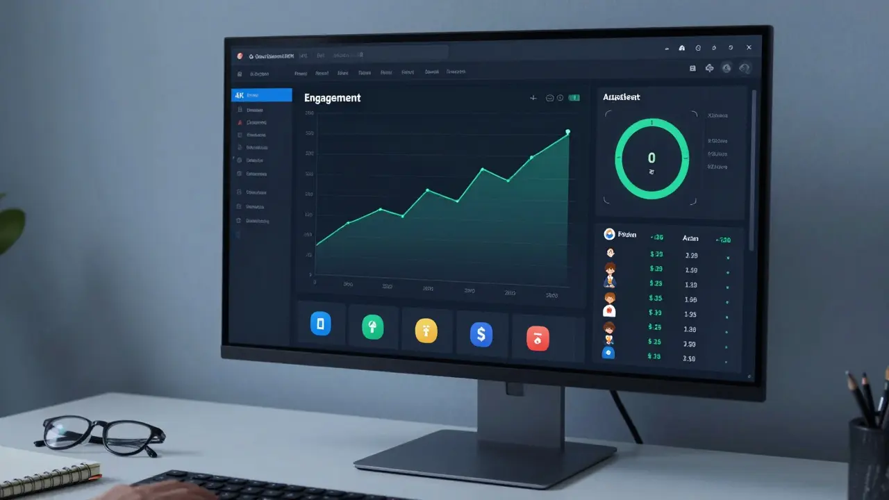
Building a dashboard for course metrics transforms raw numbers into a visual story. It allows instructors and administrators to make real-time decisions rather than waiting for end-of-term reports. Whether you are teaching a small workshop or managing a massive open online course (MOOC), a well-designed dashboard gives you immediate clarity on student progress and engagement.
Defining Your Core Course Metrics
Before you pick a tool or design a chart, you need to decide what actually matters. Many dashboards fail because they show everything but highlight nothing. You must identify the key performance indicators (KPIs) that align with your educational goals.
Start with these four foundational metrics:
- Completion Rate: The percentage of students who finish the course. This is your baseline for success.
- Engagement Score: A composite metric tracking logins, video views, and forum posts. High engagement usually predicts higher completion rates.
- Assessment Performance: Average scores on quizzes and assignments. Look for patterns, not just averages. If everyone fails Question 4, your content needs fixing, not the students.
- Time-on-Task: How long students spend on specific modules. Too little time might mean confusion or skipping; too much might indicate difficulty or distraction.
Avoid vanity metrics like total page views if they don't correlate with learning outcomes. Focus on data that helps you intervene early. For example, if a student hasn't logged in for seven days, that is an actionable alert. If they viewed a page three times, that is just noise unless paired with assessment results.
Choosing the Right Tools for Visualization
You don't need to be a software engineer to build a powerful dashboard. The ecosystem of tools has matured significantly, offering options for every technical skill level. Your choice depends on your Learning Management System (LMS) and your team's resources.
| Tool Type | Best For | Pros | Cons |
|---|---|---|---|
| Built-in LMS Reports | Quick insights, low budget | No setup required, integrated data | Limited customization, static views |
| BI Platforms (Power BI, Tableau) | Advanced analysis, cross-system data | Highly customizable, interactive visuals | Steep learning curve, requires data export |
| No-Code Dashboards (Geckoboard, Klipfolio) | Real-time monitoring, teams | Easy drag-and-drop, live updates | Monthly subscription costs, limited deep-dive |
| Custom Code (Python/R + Streamlit) | Developers, unique needs | Total control, free if self-hosted | Requires coding skills, maintenance overhead |
If you use platforms like Canvas, Moodle, or Blackboard, start with their native analytics. They often provide basic cohort reports and student activity feeds. However, these tools rarely allow you to combine data from external sources, such as CRM systems or email marketing platforms. For a holistic view, you may need to connect your LMS to a Business Intelligence (BI) tool like Microsoft Power BI or Tableau. These platforms handle large datasets well and offer sophisticated filtering capabilities.
Designing for Clarity and Action
Data visualization is not just about making charts look pretty. It is about reducing cognitive load. When a teacher opens a dashboard, they should understand the status of their class within five seconds. Use established principles of visual hierarchy to guide the eye.
Place the most critical metrics at the top left. In Western reading patterns, this is where attention lands first. Use large, bold fonts for key numbers like "Current Enrollment" or "At-Risk Students." Below these, place trend lines that show changes over time. A line chart showing weekly engagement drops is far more useful than a pie chart showing gender distribution, unless diversity equity and inclusion (DEI) is your primary focus for that specific session.
Color should be used functionally, not decoratively. Use green for positive trends, red for alerts, and neutral grays for context. Avoid rainbow colors unless you are mapping distinct categories. Consistency is key: if red means "low score" in one chart, it must mean "low score" in all charts. Confusing color schemes lead to misinterpretation and ignored warnings.
Incorporate drill-down capabilities. A high-level view shows overall course health. Clicking on a specific module should reveal individual student performance. This layered approach prevents clutter while providing depth when needed. For instance, a bar chart might show average quiz scores per week. Clicking on Week 3 could open a list of students who scored below 50%, allowing for targeted outreach.

Integrating Data Sources Seamlessly
The biggest hurdle in dashboard creation is often data silos. Student information lives in the LMS, financial data in the billing system, and communication history in the email platform. To get a true picture of learner success, you need to merge these streams.
Most modern LMS platforms support APIs (Application Programming Interfaces) that allow data extraction. If you are using a BI tool, look for pre-built connectors for popular systems like Salesforce, HubSpot, or Google Sheets. For smaller operations, exporting CSV files weekly and uploading them to a cloud storage bucket can work, though it introduces latency.
Consider the frequency of updates. Real-time dashboards are impressive but often unnecessary for course metrics. Daily or weekly refreshes are usually sufficient for pedagogical adjustments. Real-time is crucial only for operational metrics, like server load during a live exam. Align your data pipeline with your decision-making speed. If you check the dashboard once a week, hourly updates are wasted resources.
Interpreting Trends and Identifying Risks
A dashboard is useless if no one acts on it. Train your team to look for anomalies, not just averages. An average quiz score of 75% looks good, but it might hide a bimodal distribution where half the class gets 90% and half gets 60%. Visualizing the distribution with a histogram reveals this gap immediately.
Set up automated alerts for risk factors. Common triggers include:
- Three consecutive missed assignments.
- A sudden drop in login frequency after a spike.
- Negative sentiment in discussion forums (if using text analytics).
When you spot a trend, ask "why?" before acting. Did engagement drop because the material got harder, or because of a holiday break? Context matters. Cross-reference your course metrics with calendar events and syllabus milestones. A dip in activity during finals week is expected; a dip during a simple review module is a warning sign.
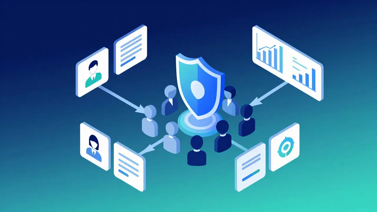
Ensuring Privacy and Ethical Use
Student data is sensitive. As you build your dashboard, you must comply with regulations like FERPA in the United States, GDPR in Europe, or local privacy laws in New Zealand and other regions. Never display personally identifiable information (PII) like names or student IDs on public-facing dashboards or shared screens without explicit consent and security measures.
Anonymize data wherever possible. Use student IDs instead of names in aggregate reports. Restrict access to detailed individual records to authorized instructors only. Implement role-based access control (RBAC) so that administrative staff see enrollment numbers, while teachers see academic performance. Regularly audit who has access to the dashboard and why. Transparency builds trust with students, who should know how their data is being used to improve their learning experience.
Iterating Based on Feedback
Your first dashboard will not be perfect. Treat it as a living product. Share it with colleagues and ask specific questions: "What was hard to find?" "Which chart did you ignore?" "Did any metric surprise you?"
Remove elements that go unused. If no one clicks on the "Forum Activity" widget after a month, delete it. White space is valuable. Add features based on recurring requests. Maybe teachers want to filter by major or department. Maybe administrators need a view of revenue per course. Iterate quarterly. The goal is a tool that feels intuitive and indispensable, not a complex report that gathers digital dust.
What is the best tool for beginners to create a course metrics dashboard?
For beginners, start with the built-in analytics of your Learning Management System (LMS). Platforms like Canvas, Moodle, and Blackboard offer ready-made reports. If you need more flexibility, no-code tools like Geckoboard or Klipfolio are user-friendly and require minimal setup. They connect easily to common data sources via drag-and-drop interfaces.
How often should I update my course dashboard data?
For most educational purposes, updating data daily or weekly is sufficient. This frequency balances freshness with resource usage. Real-time updates are only necessary for operational monitoring, such as tracking live exam traffic or server performance. Weekly updates allow enough time for meaningful trends to emerge without overwhelming users with minor fluctuations.
Can I combine data from different platforms in one dashboard?
Yes, you can integrate data from multiple sources using Business Intelligence (BI) tools like Power BI or Tableau. These platforms offer connectors for various systems, including CRMs, email services, and spreadsheets. You may need to clean and normalize the data first to ensure consistency, but combining sources provides a holistic view of student engagement and success.
What are the most important metrics to track for online courses?
Focus on completion rate, engagement score, assessment performance, and time-on-task. Completion rate measures overall success. Engagement score tracks active participation. Assessment performance highlights content effectiveness. Time-on-task reveals potential difficulties or distractions. These four metrics provide a comprehensive overview of both student behavior and course quality.
How do I ensure student privacy when displaying course metrics?
Comply with relevant privacy laws like FERPA or GDPR. Avoid displaying personally identifiable information (PII) on public or shared dashboards. Use anonymized IDs instead of names. Implement role-based access control to restrict detailed data to authorized personnel only. Regularly audit access permissions and inform students about how their data is used to maintain trust and ethical standards.
Comments
Joe Walters
you guys really think this is new?? i have been using tableau for years and let me tell you its not as simple as drag and drop because the data is always messy and corrupted and nobody knows how to clean it properly so dont act like you discovered fire here
Robert Barakat
The essence of measurement lies not in the number but in the interpretation of the void between the numbers. We seek patterns in chaos yet we create the chaos by forcing human behavior into rigid categorical boxes that never truly fit the fluid nature of learning.
Michael Richards
You are wasting your time if you do not start with Power BI immediately. Tableau is overpriced garbage for small teams and no-code tools are toys for people who cannot handle real data structures. If you cannot write SQL queries to join tables before building a single chart you are not ready to build a dashboard period stop trying to use Geckoboard and learn actual data engineering or admit you are not serious about analytics
Laura Davis
I appreciate the detailed breakdown here but I feel like we need to talk more about the emotional impact on teachers when they see these red alerts constantly popping up. It creates anxiety rather than clarity sometimes. We need to ensure the dashboard supports the educator not overwhelms them with noise that feels like surveillance rather than support.
Lisa Nally
Actually from a pedagogical standpoint the integration of multimodal learning analytics requires a sophisticated understanding of xAPI standards and LRS infrastructure which most institutions completely ignore. You cannot simply export CSVs and expect valid longitudinal data without addressing schema drift and entity resolution issues in your ETL pipeline.
Edward Gilbreath
they want to track every click and login because they want to sell our attention spans to advertisers eventually its all part of the big brother plan to monitor student behavior and predict dissent before it happens so keep your data private and trust no one especially not the lms vendors
kimberly de Bruin
the silence of the unengaged student speaks louder than any metric can capture we try to quantify the soul of education but we only measure the shadow cast by the body
Edward Nigma
Everyone says use green for good and red for bad but what about colorblind users?? This advice is fundamentally flawed and ignores basic accessibility standards WCAG 2.1 AA compliance requires contrast ratios and alternative indicators not just semantic colors so you are actually creating barriers for disabled educators and students by following this generic design guide
Francis Laquerre
In my experience working with international cohorts the cultural context of engagement varies wildly. A student in Tokyo may log in frequently but rarely post due to cultural norms around public participation whereas a student in Brazil might dominate forums but skip readings. Your dashboard must account for these sociological nuances or it will misinterpret silence as disengagement and activity as mastery which leads to terrible interventions.
michael rome
It is imperative that we consider the ethical implications of algorithmic bias in these dashboards. When we automate risk identification we often encode historical prejudices into the system labeling certain demographics as at-risk based on flawed correlation models. We must audit our algorithms regularly to ensure equity and fairness in educational outcomes.
Andrea Alonzo
I find that when we involve the students in defining what success looks like the metrics become much more meaningful and less punitive. Instead of just tracking completion rates we could track self-reported confidence levels and peer collaboration frequency which gives us a richer picture of the learning ecosystem and fosters a sense of agency among the learners themselves rather than treating them as passive data points to be managed and controlled by the institution.