

Imagine trying to learn a new language or solve complex math problems while navigating an app that refuses to speak its buttons. For millions of users with visual impairments, this is the daily reality when developers treat accessibility as an afterthought. In the world of mobile learning applications, where interaction is key to retention, a broken screen reader flow doesn't just cause frustration-it causes failure. If your app cannot be navigated via VoiceOver on iOS or TalkBack on Android, you are effectively locking out a significant portion of your potential student base.
Testing these flows isn't about ticking boxes for compliance; it's about ensuring the cognitive load placed on a blind user matches that of a sighted one. You need to verify that every tap, swipe, and gesture translates into clear, actionable audio feedback. This guide walks you through the specific mechanics of testing screen reader interactions on both major mobile platforms, focusing on the unique challenges presented by educational content like quizzes, progress trackers, and interactive diagrams.
The Core Mechanics: VoiceOver vs. TalkBack
Before diving into specific test cases, you must understand how the two dominant screen readers handle information differently. They share a common goal but use distinct interaction models that require separate testing strategies.
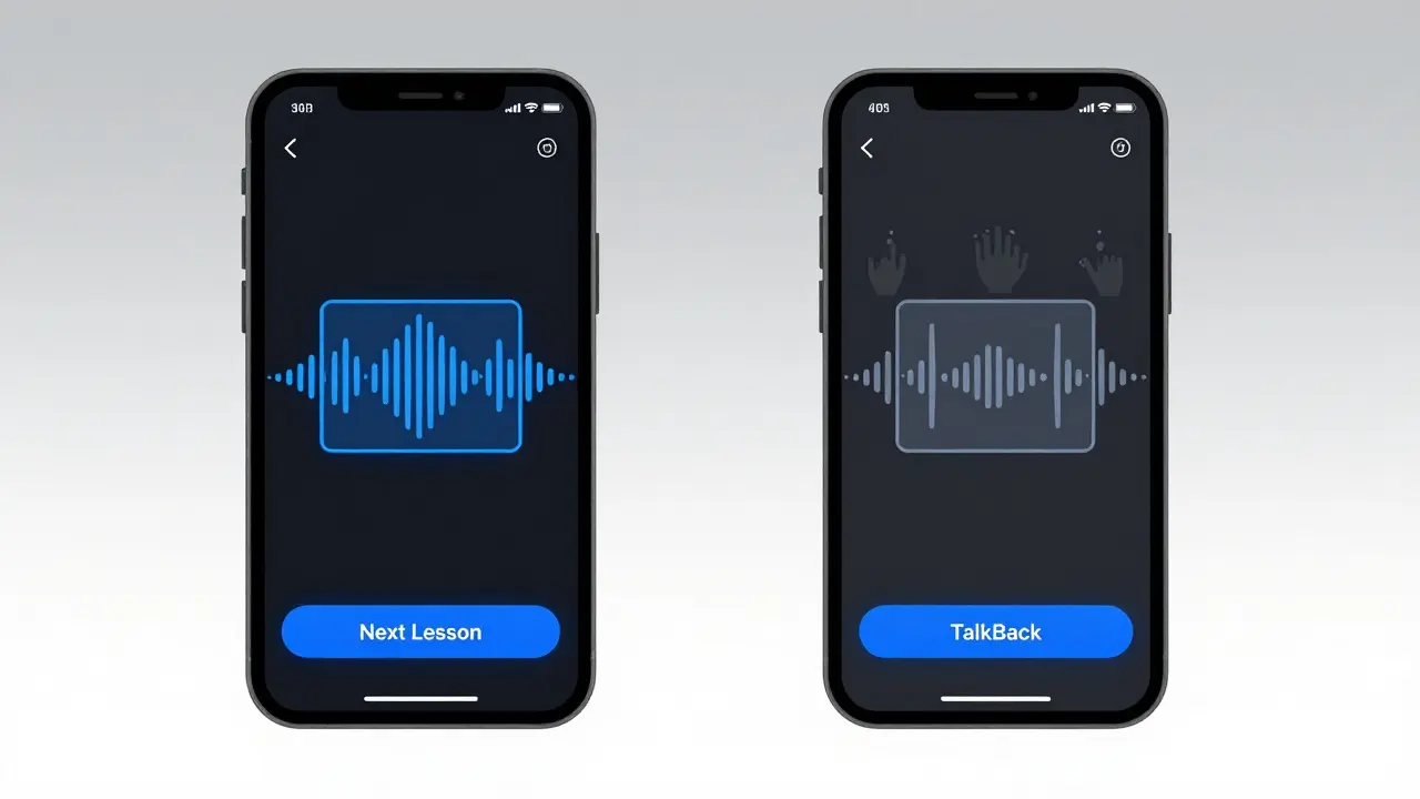
VoiceOver is Apple’s built-in screen reader for iOS devices. It operates on a "double-tap" paradigm. A single tap selects an element (highlighting it with a blue box), and a double-tap anywhere on the screen activates it. Navigation is primarily done via swiping left or right to move between focusable elements. VoiceOver also relies heavily on rotor controls for changing settings like reading speed or heading levels without leaving the current context.
In contrast, TalkBack is Google’s screen reader for Android. While it also uses gestures, its default activation often involves a double-tap to select and then a subsequent double-tap to activate, though this can vary based on user customization. TalkBack allows for more granular exploration using finger gestures, such as dragging one finger across the screen to read text linearly or two fingers to scroll. The key difference lies in the verbosity and the way dynamic content is announced. TalkBack tends to be more explicit about layout changes, whereas VoiceOver might summarize them unless configured otherwise.
| Action | iOS VoiceOver | Android TalkBack |
|---|---|---|
| Select Element | Single Tap | Double Tap (Default) |
| Activate Element | Double Tap Anywhere | Double Tap on Element |
| Navigate Forward | Swipe Right | Swipe Right |
| Read Line by Line | Swipe Up/Down | Drag One Finger |
| Scroll Page | Three-Finger Swipe | Two-Finger Swipe |
When testing your learning app, you cannot assume parity. A workflow that feels intuitive in VoiceOver might feel disjointed in TalkBack due to differences in how they announce list items or form fields. Always test critical paths-like signing up for a course or submitting a quiz answer-on both platforms independently.
Structuring Content for Linear Consumption
Sighted users scan pages. They look for headings, bold text, and images to understand structure instantly. Blind users consume content linearly, from top to bottom. If your learning app presents a dense block of text without semantic structure, the user will get lost. Your first testing priority should be verifying the logical order of elements.
Start by turning off visual cues completely. Close your eyes or turn off the screen entirely. Navigate through a lesson module using only the screen reader. Does the announcement order match the visual hierarchy? Often, developers place decorative icons or navigation bars before the main content in the code tree, forcing the user to swipe through irrelevant elements before reaching the actual lesson material.
Check for proper use of headings. In iOS, ensure that headings are marked with the appropriate role (`UIAccessibilityTraitHeader`). In Android, use `android:importantForAccessibility="yes"` and set the content description appropriately. When testing, use the Rotor feature in VoiceOver or the Headings gesture in TalkBack to jump between sections. If the user cannot skip directly to the next lesson topic, your semantic structure is flawed.
Pay special attention to images and diagrams. Educational apps rely heavily on visuals. A chart showing statistical trends is useless if the screen reader announces "Image" with no further detail. You must provide concise, meaningful alt-text. However, avoid describing every pixel. Instead, describe the insight. For example, instead of "A bar chart with blue bars," use "Bar chart showing a 20% increase in user engagement over Q3." Test this by checking if the alt-text is read immediately upon selecting the image, not after a delay or additional gesture.
Interactive Elements: Quizzes and Inputs
Learning apps are interactive. They require input. This is where accessibility often breaks down. Standard buttons are usually fine, but custom-designed UI components frequently fail to expose their state or function to screen readers.
Consider a multiple-choice quiz. Sighted users see four options. A blind user needs to know there are four options, which one is selected, and what happens when they choose one. Test the following scenarios:
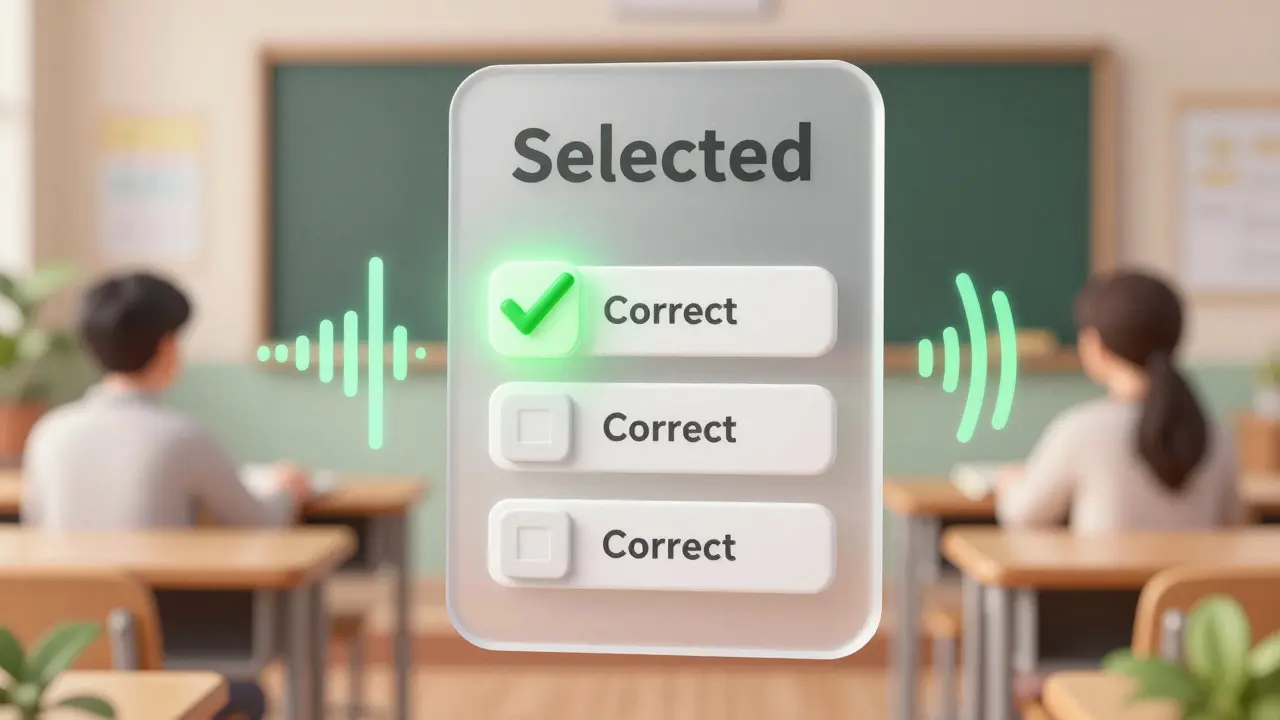
- Selection State: When a user taps an answer choice, does the screen reader announce "Selected" or "Checked"? If the app highlights the option visually but doesn't update the accessibility label, the user won't know their choice was registered.
- Grouping: Are the radio buttons grouped logically? On iOS, ensure they share the same accessibility identifier or group trait. On Android, use `
` with proper accessibility delegates. This prevents the screen reader from announcing each button as an isolated entity rather than part of a set. - Feedback: After submitting an answer, immediate auditory feedback is crucial. Does the app say "Correct" or "Incorrect"? Avoid relying solely on color changes (red for wrong, green for correct). Use haptic feedback combined with clear audio announcements.
Text inputs pose another challenge. Ensure that keyboard types match the expected input. If a field asks for a phone number, the numeric keypad should appear automatically. More importantly, check for error handling. If a user enters invalid data, the screen reader must announce the error message clearly and move focus to the problematic field. Vague errors like "Invalid Input" are unhelpful. Specific messages like "Email address missing @ symbol" allow the user to correct the mistake efficiently.
Dynamic Content and Live Regions
Modern learning apps often update content dynamically. Think of a live chat with a tutor, a countdown timer for a timed exam, or a progress bar filling up as a video plays. These changes happen without a full page reload, which means standard screen reader events might miss them.
To test this, you need to utilize "Live Regions." In iOS, this involves setting `UIAccessibilityAnnouncementNotification`. In Android, you use `ViewCompat.setAccessibilityLiveRegion()`. Without these, the screen reader will remain silent while the timer counts down or the progress bar moves, leaving the user unaware of the passage of time or their completion status.
Perform a stress test on these features. Start a timed quiz and listen carefully. Does the screen reader interrupt the user’s current task to announce the remaining time? Ideally, urgent updates (like "10 seconds remaining") should be announced immediately, while less critical updates (like progress bar increments) should wait until the user pauses or completes an action. Poorly implemented live regions can create a cacophony of overlapping speech, making the app unusable.
Gestures and Custom Interactions
Educational apps sometimes introduce custom gestures to enhance engagement. Swiping to reveal flashcards, pinching to zoom into a map, or drawing on a canvas are common features. These interactions are notoriously difficult to make accessible because they bypass standard touch targets.
If your app requires a swipe to flip a flashcard, ensure there is an alternative method. Perhaps a button labeled "Flip Card" exists for screen reader users. Testing this involves verifying that the custom gesture is disabled or ignored when the screen reader is active, preventing accidental triggers. Alternatively, provide a detailed instruction overlay that explains how to perform the gesture within the screen reader context, such as "Use two-finger swipe to flip card."
For drawing or handwriting recognition tools, consider providing a text-input alternative. Not all users can draw accurately via touch, especially if they lack visual feedback. Offering a keyboard input mode ensures that all learners can participate in activities requiring written responses.
Automated vs. Manual Testing
While automated tools like Axe Accessibility or Lighthouse can catch basic issues-such as missing alt tags or low contrast-they cannot evaluate the flow or logic of an app. They tell you if an element has a label, but not if the label makes sense in context.
Manual testing remains irreplaceable. You need to simulate real-world usage patterns. Try completing a full course module without looking at the screen. Note where you hesitate, where you repeat actions, or where you lose track of your location in the app. Record these pain points. Then, iterate on the design and code to resolve them.
Involve users with disabilities in your beta testing phase. Their insights will uncover nuances that even experienced testers might miss. For instance, a user might find that the default reading speed is too fast for complex scientific terminology, suggesting a need for adjustable playback speeds within the app itself.
Performance and Battery Impact
Screen readers add computational overhead. They continuously monitor the UI for changes and synthesize speech in real-time. Poorly optimized apps can drain battery life quickly or cause lag, which disrupts the audio stream. Laggy audio creates gaps in information, causing confusion.
Test your app’s performance with the screen reader enabled. Monitor CPU usage and memory consumption. Ensure that animations are smooth and that UI updates are batched efficiently. Large lists of lessons or resources should use virtualization techniques to render only visible items, reducing the workload on the accessibility engine.
What is the most common mistake developers make with screen readers?
The most frequent error is neglecting the logical order of elements. Developers often prioritize visual layout over DOM order, causing screen readers to announce elements in a confusing sequence that doesn't match the visual hierarchy. This forces users to navigate back and forth excessively to understand the content.
Do I need to test on both iOS and Android separately?
Yes, absolutely. VoiceOver and TalkBack have different interaction models, announcement styles, and gesture sets. An app that works perfectly on iOS may have broken navigation or unclear feedback on Android. Testing on both platforms ensures a consistent experience for all users regardless of their device preference.
How do I handle complex charts and graphs in learning apps?
Provide detailed alt-text that describes the trend or insight rather than just the visual appearance. For highly complex data, consider offering a downloadable data table or an audio description track that walks through the key points step-by-step. Never rely solely on the image itself to convey critical information.
Can automated tools replace manual accessibility testing?
No. Automated tools can identify technical violations like missing labels or poor contrast, but they cannot assess usability, logical flow, or the clarity of instructions. Manual testing with actual screen readers is essential to ensure the app is genuinely usable and not just technically compliant.
What should I do if my app uses custom gestures?
Always provide an alternative method for interacting with custom gestures. This could be a standard button or a simplified gesture sequence explained clearly in the accessibility settings. Ensure that custom gestures do not interfere with standard screen reader navigation, which relies on specific swipe patterns.