


Picture this: You’ve spent months scripting, recording, and designing an online course. The content is brilliant. The visuals are sharp. You hit publish, confident it’s ready. But within a week, students are emailing you. A video won’t load on mobile. A quiz question has two correct answers. The final assessment doesn’t track in the learning management system (LMS). Suddenly, your reputation takes a hit, and you’re scrambling to fix basic errors that should have been caught earlier.
This isn’t just bad luck; it’s a failure of quality assurance in instructional design. In the world of e-learning, content alone doesn’t make a good course. Structure, usability, technical stability, and accessibility do. Without a rigorous QA process, even the most engaging material can fail to deliver results. Quality assurance isn’t about finding faults-it’s about ensuring the learner’s experience is seamless, effective, and professional from start to finish.
The Four Pillars of E-Learning Quality Assurance
When we talk about checking an online course, we aren’t just looking for typos. We are evaluating a complex digital product that involves media, code, pedagogy, and user interface. To build a robust QA framework, you need to look at four distinct areas: Instructional Design, Technical Functionality, Accessibility, and User Experience (UX). Each pillar supports the others. If one collapses, the whole structure suffers.
Instructional Design is the systematic process of creating instructional materials that facilitate learning. It ensures the content actually teaches what it promises. ID focuses on alignment between objectives, activities, and assessments. If your objective is to teach Excel formulas, but your assessment only asks multiple-choice questions about history, your ID is broken. QA here means verifying that every module delivers on its learning promise without cognitive overload.
Technical Functionality is the operational reliability of course components across different devices and platforms. This includes video playback, quiz scoring, navigation buttons, and LMS integration. A course might be pedagogically perfect, but if the "Next" button doesn’t work on an iPad, the student stops learning. Technical QA ensures the machinery behind the scenes runs smoothly.
Accessibility is the practice of making courses usable by people with diverse abilities, including visual, auditory, motor, and cognitive impairments. Compliance with standards like WCAG 2.1 AA is not optional; it’s often legal requirement and moral imperative. Accessibility QA checks for alt text, captioning, keyboard navigation, and color contrast. It ensures no learner is excluded based on their physical or neurological differences.
User Experience (UX) is the overall feeling and ease of use a student experiences while navigating the course. UX goes beyond functionality to include clarity, aesthetics, and flow. Is the language simple? Are instructions clear? Does the design guide the eye naturally? Poor UX causes frustration, which leads to dropouts. Good UX keeps students engaged and focused on the content, not fighting the interface.
Instructional Design Checklist: Aligning Content with Goals
The first step in any QA process is reviewing the educational backbone. Before you check a single pixel, ask yourself if the course makes sense as a teaching tool. Misalignment here is the most common cause of poor completion rates.
- Learning Objectives: Are they specific, measurable, achievable, relevant, and time-bound (SMART)? Can a student clearly state what they will know or be able to do after each module?
- Content Alignment: Does every slide, video, or reading directly support the stated objectives? Remove any "nice-to-know" fluff that distracts from core goals.
- Assessment Validity: Do quizzes and assignments actually test the skills taught? Avoid trick questions. Ensure feedback explains why an answer is right or wrong, reinforcing the lesson.
- Cognitive Load: Is information chunked appropriately? Long blocks of text overwhelm working memory. Break concepts into bite-sized segments with clear headings and summaries.
- Consistency: Are terms defined once and used consistently throughout? Switching terminology confuses learners. If you call it a "dashboard" in Module 1, don’t call it a "control panel" in Module 3.
For example, if you’re building a safety training course for construction workers, your objective might be "Identify three types of hazardous waste." Your assessment must require them to identify those types, not just read about them. If the video shows ten types but only tests three, clarify which ones matter. Clarity is kindness in instructional design.
Technical Functionality Checklist: Ensuring Smooth Performance
Once the pedagogy is solid, you must verify the technology works. Students use a wide variety of devices and browsers. Your course needs to perform reliably across all of them. This phase requires testing on real hardware, not just simulators.
| Test Area | What to Check | Why It Matters |
|---|---|---|
| Video Playback | Load times, buffering, audio sync, controls visibility | Poor video quality causes immediate dropout. Audio out of sync breaks immersion. |
| Quiz Logic | Scoring accuracy, randomization, timer functionality, feedback display | Incorrect scoring destroys trust. Broken timers add unnecessary stress. |
| LMS Integration | SCORM/xAPI tracking, completion status, grade pass-back | If the LMS doesn’t record progress, corporate clients won’t pay. Certification fails. |
| Navigation | Buttons, links, menu structure, back/forward functionality | Broken links trap users. Confusing menus increase bounce rates. |
| Mobile Responsiveness | Text readability, touch targets, layout shifts on small screens | Over 60% of learners access courses via mobile. Poor mobile UX kills engagement. |
Pay special attention to SCORM (Sharable Content Object Reference Model, a standard for e-learning software products) compatibility. Most corporate LMS platforms rely on SCORM or xAPI to track learner progress. If your course package doesn’t communicate correctly with the LMS, the student might complete the course, but the system shows zero progress. Always upload a test version to your actual LMS environment before final release. Don’t assume it works because it worked in Articulate Storyline or Adobe Captivate preview mode.
Accessibility Checklist: Making Learning Inclusive
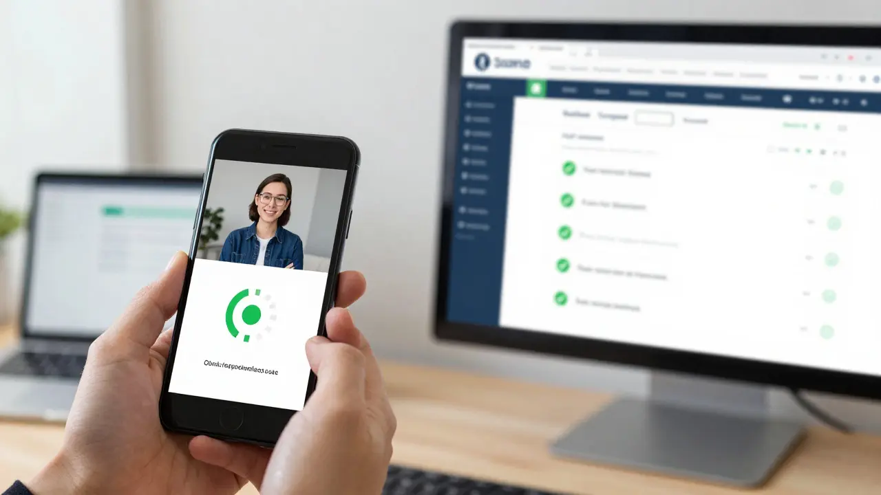
Accessibility is often treated as an afterthought, but it should be built in from day one. An inaccessible course excludes millions of potential learners and exposes organizations to legal risk. The Web Content Accessibility Guidelines (WCAG) 2.1 provide the global standard for web accessibility. Aim for Level AA compliance at minimum.
- Alt Text for Images: Every meaningful image must have descriptive alternative text. Decorative images should have empty alt tags so screen readers skip them. Don’t use filenames like "IMG_1234.jpg" as alt text.
- Captions and Transcripts: All video and audio content must have accurate captions. Provide downloadable transcripts for deaf or hard-of-hearing learners, and for those who prefer reading.
- Color Contrast: Text must have sufficient contrast against its background. Use tools like the WebAIM Contrast Checker to verify ratios meet 4.5:1 for normal text. Don’t rely on color alone to convey information (e.g., red for error, green for success).
- Keyboard Navigation: Can a user navigate the entire course using only the Tab key? Focus indicators must be visible. Interactive elements like buttons and links must be operable without a mouse.
- Font Size and Readability: Use scalable fonts. Avoid justified text, which creates uneven spacing that dyslexic learners struggle with. Left-aligned text is easier to read.
Consider a learner using a screen reader like JAWS or NVDA. If your interactive quiz relies on drag-and-drop without keyboard alternatives, that learner is stuck. Add keyboard shortcuts or radio button equivalents. Small adjustments like these open doors for everyone.
User Experience (UX) Checklist: Enhancing Engagement
Even if your course is technically sound and accessible, it can still fail if it feels clunky or confusing. UX is about reducing friction. The goal is to make the interface disappear so the learner focuses entirely on the content.
- Clear Instructions: Start each activity with explicit directions. Tell students exactly what to click, type, or watch. Ambiguity causes anxiety. Instead of "Complete the task," say "Click the blue button to submit your answer."
- Visual Hierarchy: Use size, color, and spacing to guide the eye. Important information should stand out. Don’t clutter slides with too many elements. White space is your friend.
- Loading Times: Optimize media files. Large videos and high-res images slow down page loads. Compress assets without sacrificing quality. If a page takes more than three seconds to load, students will leave.
- Feedback Loops: Provide immediate feedback for interactions. Let students know if they succeeded or failed instantly. Delayed feedback reduces learning effectiveness.
- Error Prevention: Design interfaces that minimize mistakes. Use confirmation dialogs for irreversible actions. Validate form inputs before submission to prevent frustrating errors.
Think about your own experience scrolling through a website. If the menu hides behind a tiny icon, or the font is too small to read on your phone, you get annoyed. Apply that same empathy to your course design. Simplicity wins.
Implementing the QA Process: Best Practices
Having a checklist is useless if you don’t use it systematically. Integrate QA into your development workflow from the beginning, not as a final step. Here’s how to make it stick.
- Start Early: Review storyboards and scripts for instructional alignment before production begins. Fixing a script error costs minutes; fixing a recorded video error costs hours.
- Use Multiple Testers: Don’t rely solely on the developer. Fresh eyes catch things you’ve become blind to. Include someone unfamiliar with the subject matter to test clarity.
- Test on Real Devices: Simulators are helpful, but nothing replaces testing on actual iPhones, Androids, tablets, and desktops. Browser inconsistencies are real.
- Create a Bug Log: Document every issue found during testing. Include steps to reproduce, severity level, and screenshots. Track fixes until resolution.
- Iterate: QA is not a one-time event. After launch, monitor analytics and user feedback. Identify drop-off points and refine accordingly.
Assign roles clearly. Who is responsible for content review? Who handles technical testing? Who verifies accessibility? Clear ownership prevents tasks from falling through the cracks.
Common Pitfalls to Avoid
Even experienced teams stumble. Watch out for these frequent mistakes.
- Rushing the Final Review: Deadlines pressure teams to skip thorough testing. Result: public embarrassment and lost revenue. Build buffer time into your project plan.
- Ignoring Mobile Users: Assuming desktop-only usage is outdated. Mobile traffic dominates. If your course isn’t mobile-friendly, you’re ignoring half your audience.
- Overcomplicating Interactions: Fancy animations and complex drag-and-drops often break on older devices. Prioritize function over flair. Simple interactions are more reliable.
- Neglecting Soft Skills Training: QA checklists for soft skills courses differ slightly. Focus heavily on scenario realism and emotional resonance. Role-play simulations need careful scripting to avoid awkwardness.
Remember, quality assurance is an investment, not a cost. A well-tested course builds credibility, boosts completion rates, and generates positive reviews. It saves you time in the long run by reducing support tickets and rework.
How long does the QA process take for an online course?
The duration depends on course length and complexity. For a standard 2-hour course, allocate 1-2 weeks for thorough QA. Shorter microlearning modules may take 2-3 days. Complex simulations with branching scenarios require more time due to extensive path testing. Always build extra time into your schedule for unexpected bugs.
Do I need specialized tools for accessibility testing?
While automated tools like WAVE or Axe can catch obvious issues, they miss context-dependent problems. Combine automated scans with manual testing using screen readers like NVDA or VoiceOver. Human judgment is essential for evaluating alt text relevance and logical reading order.
What is the difference between SCORM and xAPI?
SCORM tracks basic metrics like completion and score within an LMS. xAPI (Experience API) records detailed learning experiences, including offline activities and social interactions. xAPI offers richer data for analytics but requires an LRS (Learning Record Store) instead of a traditional LMS. Choose based on your reporting needs.
Should I test my course on all possible devices?
Testing on every device is impossible. Focus on the most popular browsers (Chrome, Safari, Firefox, Edge) and operating systems (iOS, Android, Windows, macOS) used by your target audience. Use browser statistics from your LMS or industry reports to prioritize. Responsive design principles help cover edge cases.
How do I handle feedback from beta testers?
Collect feedback systematically using surveys or observation sessions. Categorize comments into critical bugs, usability improvements, and subjective preferences. Prioritize fixes that impact learning outcomes or technical stability. Not every suggestion needs implementation-stay aligned with your original learning objectives.