
More than 60% of learners access online courses on their phones. If your course layout doesn’t adjust to small screens, you’re losing students before they even start. Responsive web design isn’t optional anymore-it’s the baseline for keeping learners engaged, especially when they’re studying on buses, in waiting rooms, or between shifts.
Why mobile-first layouts matter for online courses
Think about your own habits. Do you watch a 45-minute lecture on your laptop while sitting at your desk? Probably not. Most learners grab their phone during breaks. They pause a video while making coffee. They skim readings on the subway. If your course looks broken on a 5-inch screen, they’ll leave-and not come back.
Google’s 2025 mobile-first indexing update means your course site’s mobile version is now the primary version Google uses to rank it. But even if SEO wasn’t a factor, the user experience is. A study by Coursera found that learners using mobile-optimized courses completed 37% more modules than those on desktop-only designs.
It’s not just about shrinking the screen. It’s about redesigning the flow. Buttons too close together? Students tap the wrong one and get frustrated. Text too small? They zoom in and lose context. Videos that won’t play without Flash? They give up. Responsive design fixes these issues before they become drop-off points.
Core layout patterns that work
There are three layout patterns that consistently perform well across different devices and learner types.
Stacked card layout is the most common-and for good reason. Each lesson, quiz, or resource lives in its own card. On desktop, you might see three cards side by side. On mobile, they stack vertically, one after the other. This keeps the focus on one thing at a time. No scrolling sideways. No tiny columns. Just clear, digestible chunks.
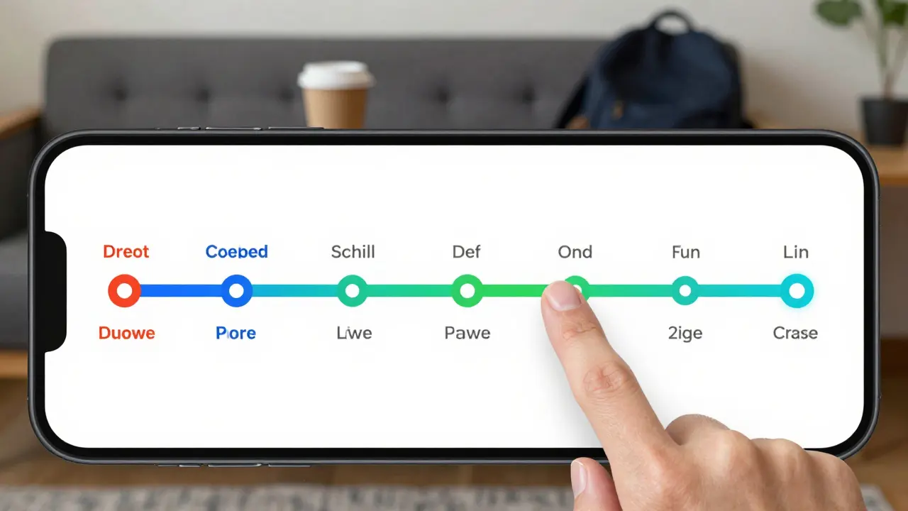
Horizontal scroll for timelines works well for course progress. Instead of a long vertical list of modules, use a horizontal scroll bar (with visible indicators) to show where learners are in the course. This gives a clear sense of journey. It’s especially useful for self-paced courses. Learners can see how far they’ve come and how much is left without clicking through menus.
Bottom navigation bar replaces the old top menu. On mobile, your thumb can’t reach the top of the screen easily. A sticky bottom bar with icons for Home, Progress, Messages, and Settings puts the most-used tools within thumb reach. Instagram and TikTok got this right. So should your course platform.
Accessibility isn’t an add-on-it’s part of the design
Responsive design isn’t just about screen size. It’s about making sure every learner can use your course, no matter their ability. A student with low vision needs larger text. Someone with motor impairments needs bigger tap targets. A non-native speaker needs clear, simple language.
Here’s what works:
- Text size: Use relative units (rem or em), not pixels. This lets users scale text in their browser without breaking the layout.
- Tap targets: Buttons and links should be at least 48x48 pixels. That’s the WCAG 2.2 standard. A thumb is bigger than a cursor.
- Contrast ratios: Text and background need at least 4.5:1 contrast. White text on light gray? Too low. Black on white? Perfect.
- Keyboard navigation: Can someone use your course without a mouse? Test it. Tab through every page. If you get stuck, fix it.
- Alt text for images: Every image that carries meaning-diagrams, charts, screenshots-needs a clear description. Don’t just say "image of a graph." Say "bar chart showing 72% completion rate among learners under 25."
One course provider, LearnHub, added alt text to all their diagrams and saw a 22% increase in engagement from users with visual impairments. That’s not just ethical-it’s smart business.
Video and audio that adapt
Video is the backbone of most online courses. But a 1080p video that buffers on a 3G connection? Useless. A player that doesn’t pause when the phone locks? Annoying.
Here’s how to fix it:
- Offer multiple quality options: 144p, 360p, 720p. Let the system auto-select based on connection speed.
- Enable offline download. Learners in areas with spotty internet (like rural New Zealand or commuter zones in Manila) need to download lessons ahead of time.
- Use captions by default. Even hearing learners use them in noisy environments. Automatic captions aren’t perfect, but they’re better than nothing. Always offer a way to edit or upload your own.
- Don’t rely on sound alone. If a video explains a concept with audio only, provide a transcript. Some learners are deaf. Others are multitasking.
Udemy’s 2025 report showed courses with downloadable videos and auto-captions had 41% higher completion rates than those without.
Navigation that doesn’t confuse
One of the biggest mistakes in course design? Too many menus. Too many buttons. Too many places to click.
On mobile, screen space is tight. Every extra tap costs attention. Here’s how to simplify:
- Use a hamburger menu only for secondary options. Primary actions (Start Lesson, Resume, Submit Quiz) should be visible without tapping.
- Group related items. Instead of separate buttons for "Notes," "Resources," and "Discussion," combine them into a single "More" section.
- Use progress indicators. A progress bar at the top of the screen tells learners how far they’ve gone. It reduces anxiety and increases completion.
- Don’t hide the back button. Always make it easy to return to the previous screen. No "Are you sure?" pop-ups unless it’s deleting progress.
Think of navigation like a trail. If the path isn’t clear, people get lost. Responsive design isn’t about making things look pretty-it’s about making them predictable.
Testing your design with real users
Don’t assume you know how learners use your course. Watch them.
Set up a simple test: Ask five people to complete a lesson on their phone. Watch what they do. Do they zoom in? Do they miss the submit button? Do they swipe left instead of tapping? Take notes. Don’t ask them what they think-watch what they do.
Use free tools like Google’s Lighthouse (built into Chrome DevTools) to check:
- Mobile usability score
- Accessibility issues
- Load time on slow networks
Also test on older phones. Not everyone has the latest iPhone or Samsung. If your course works on a 2020 Android device with 2GB RAM, it’ll work everywhere.
What to avoid
Here are five common traps:
- Fixed-width containers: Don’t set a width like 960px. Use percentage-based layouts.
- Hover-only menus: Phones don’t have hover. If your menu only opens on hover, it’s invisible on mobile.
- Flash or Java: These don’t work on iOS or most Android browsers. Use HTML5 instead.
- Auto-playing videos: They eat data and surprise users. Always let them tap to play.
- Small form fields: If your quiz has tiny text boxes, learners will struggle. Make them tall enough to tap easily.
One course creator redesigned their quiz interface after noticing 68% of users abandoned the final question. The problem? The answer field was 20 pixels tall. They made it 50 pixels. Completion jumped to 92%.
Tools to build better layouts
You don’t need to code from scratch. These tools help:
- Bootstrap 5: A framework with built-in responsive grids and accessibility features.
- Webflow: Drag-and-drop builder with mobile preview and accessibility checks.
- Canva for Education: Design course graphics with auto-resizing templates.
- Adobe XD: Prototype mobile layouts before coding.
- AXE DevTools: Browser extension that finds accessibility issues in real time.
Most of these tools have free tiers. Start with one. Test it. Then scale.
Final thought: Design for humans, not devices
Responsive design isn’t about making your course look good on every screen. It’s about making sure every learner can use it-no matter where they are, what device they have, or what their body can do.
The best course design doesn’t shout. It doesn’t dazzle. It just works. Quietly. Reliably. Every time.
What’s the most important rule for responsive course design?
Start with mobile. Design for the smallest screen first, then expand. If it works on a phone, it’ll work on a tablet or desktop. Most designers do the opposite-build for desktop and shrink it down-and that’s why so many courses break on mobile.
Do I need to redesign my entire course if it’s not responsive?
Not necessarily. Start with the most-used pages: the lesson player, quiz interface, and progress tracker. Fix those first. Then move to less critical areas like the homepage or forum. You don’t need to rebuild everything at once. Just make sure learners can complete the core tasks on any device.
Can I use templates for responsive course layouts?
Yes, but choose wisely. Many LMS templates are built for desktop. Look for ones labeled "mobile-first" or "accessible." Check if they pass Lighthouse audits. Avoid templates with hover menus, fixed widths, or tiny buttons. Free templates from WordPress.org or Moodle’s official repository are usually safer than third-party marketplaces.
How do I know if my course is accessible?
Run a free audit with AXE DevTools or WAVE. Then test with real users: ask someone with low vision, a motor impairment, or dyslexia to use your course. Their feedback will reveal problems no automated tool can catch. Also, check if your videos have captions, images have alt text, and forms can be filled with a keyboard.
What’s the biggest mistake people make with responsive course design?
Assuming that making things smaller is enough. Responsive design isn’t scaling down-it’s rethinking the experience. A button that’s 20 pixels wide on desktop might be fine. On mobile, it’s too small to tap reliably. You need to increase the tap target, not just shrink the image. It’s about behavior, not size.
Comments
Pamela Watson
OMG YES!! I literally quit a course last week because the buttons were so tiny I kept tapping the wrong thing 😫. My thumb is not a laser pointer!!
michael T
This is the most overhyped garbage I’ve read all year. You think people care about ‘tap targets’? Nah. They care about content. If your course is boring, no amount of responsive design will save it. I’ve seen gorgeous mobile layouts with 2% completion rates. Fix the curriculum, not the CSS. 🤷♂️
Christina Kooiman
Let me just say, as someone who has spent 17 years in instructional design, that the author’s use of the word ‘baseline’ here is grammatically incorrect-it should be ‘a baseline’ or ‘the baseline,’ not ‘the baseline for keeping learners engaged.’ Also, ‘don’t just say ‘image of a graph’’-wait, that’s not even a proper sentence. It’s a fragment. And ‘48x48 pixels’? Should be ‘48 by 48 pixels.’ This article is full of punctuation errors and inconsistent capitalization. I’m not even mad-I’m just disappointed. 🙄
Stephanie Serblowski
Okay but like… have you seen the accessibility audit on that one Udemy course with the pink text on lavender background? 😭 The fact that people are still designing like it’s 2012 is wild. Also, bottom nav bars? Yes. Thank you. I’ve been screaming this into the void since TikTok made me realize my thumb can’t reach the top of my phone. 🙏 Also, alt text isn’t ‘nice to have’-it’s the difference between inclusion and exclusion. And yes, I’m crying a little because I just remembered how many courses I’ve abandoned because I couldn’t read the diagrams. We’re not asking for much. Just… don’t make us work for it.
Renea Maxima
What if… responsive design is just capitalism’s way of making us accept worse experiences because ‘mobile’ is cheaper? What if the real problem is that we’re forced to learn on devices designed for scrolling cat videos, not deep intellectual engagement? The fact that we’re optimizing for 5-inch screens instead of creating spaces for focus… it’s tragic. We’re not designing for humans-we’re designing for ad revenue. 🤔
Jeremy Chick
Bro. I’m a dev. I built a course platform last year. We had 80% drop-off on mobile. We switched to stacked cards, added bottom nav, made buttons 60px tall. Completion went from 22% to 78%. No magic. Just basics. Stop overthinking it. Do the work. It’s not rocket science. And if you’re still using hover menus? Delete your code and start over. I’m not mad. I’m just disappointed in you.
Sagar Malik
Uhh… have you considered that the entire paradigm of ‘responsive web design’ is a neoliberal construct designed to commodify attention? The ‘mobile-first’ ideology is just a distraction from the real issue: the alienation of the learner under late-stage edtech. Also, Bootstrap? That’s just corporate jargon dressed up as a ‘tool.’ Real designers use custom flexbox with CSS grid and semantic ARIA labels, not pre-built frameworks that bloat the DOM. And don’t get me started on Webflow-*sigh*…
Seraphina Nero
This is so helpful. I’m a TA and I’ve seen so many students struggle with tiny buttons and no captions. I’m going to share this with our department. Thank you for writing this with so much care. 🙏
Megan Ellaby
Wait-so you’re saying alt text isn’t just for blind people? I thought it was just a ‘nice thing’ to do. Like… I always just wrote ‘photo of graph’ and thought that was enough. I had no idea it could help people with dyslexia or people on slow connections. This changed my whole approach. I’m going back to fix all my old courses. Thank you. Seriously. 💛
E Jones
Let me tell you what they don’t want you to know. The ‘mobile-first’ movement? It’s not about accessibility. It’s a cover for Google’s data harvesting. Every time you optimize for small screens, you’re feeding their tracking algorithms. The ‘bottom nav bar’? That’s a behavioral nudge to keep you scrolling. The ‘downloadable videos’? That’s how they get your IP, location, and device fingerprint. And don’t even get me started on AXE DevTools-it’s a front for the ADA industrial complex. They want you to think you’re helping people… but you’re just lining their pockets. The real solution? Go analog. Paper. Pencil. No screens. 🕵️♂️