Ever watched a tutorial where the instructor’s cursor vanished into a sea of white pixels? You know the feeling. You’re trying to follow along, but you can’t tell if they clicked 'Save' or just hovered over it. That moment of confusion is exactly why screen annotations exist. They aren’t just decorative; they are the difference between a video that teaches and a video that confuses.
In the world of course video production, the process of creating digital learning content using recorded screens and narration, clarity is king. When you record your screen, you are capturing everything-the cluttered desktop icons, the tiny font sizes, and the subtle mouse movements. Without intentional guidance, viewers get lost. This is where screen annotation, visual cues added to video footage to direct viewer attention and explain concepts comes in. By mastering highlighting, zooming, and callouts, you transform raw screen captures into polished, professional lessons that keep students engaged and understanding.
The Power of Visual Cues in Learning
Why do we need annotations at all? It boils down to cognitive load theory. Human brains have limited working memory. When a student watches a complex software interface, their brain has to process the visual information (what is on the screen) while simultaneously processing the auditory information (what you are saying). If the visual field is too busy, the brain drops one of those streams. Usually, it drops the audio, meaning your explanation goes unheard.
Annotations act as a spotlight. They reduce extraneous cognitive load by telling the viewer exactly where to look. Research in educational psychology consistently shows that directed attention improves retention rates. When you highlight a specific button or zoom in on a code snippet, you are essentially doing the mental work for the student. You are guiding their eyes so they don’t have to search for the relevant information themselves.
This isn’t just about being nice; it’s about effectiveness. A study published in the *Journal of Educational Psychology* found that videos with dynamic visual cues resulted in significantly higher test scores compared to static slides or unannotated recordings. In short, if you want your students to learn, you need to show them what matters.
Highlighting: Directing Attention Without Distraction
Highlighting is the most basic form of annotation, but it’s also the most versatile. The goal here is simple: make the important thing stand out from the background noise. However, there are right ways and wrong ways to do this.
Color Contrast is Key
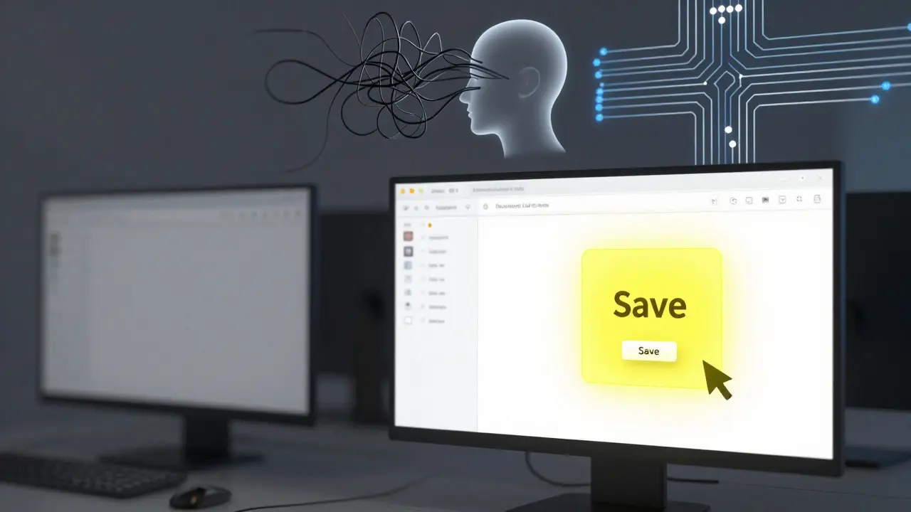
The human eye is drawn to high-contrast colors. If your software interface is mostly dark gray and black, a bright yellow or neon green highlight will pop immediately. Avoid red unless you are indicating an error or a warning, as red carries a negative psychological association. For general emphasis, stick to cool blues or vibrant yellows.
- Mouse Cursors: Consider enlarging your cursor during recording or adding a colored halo around it in post-production. A standard white arrow disappears quickly against light backgrounds.
- Text Overlays: Use bold, sans-serif fonts for text highlights. Serif fonts can be harder to read on small mobile screens. Keep the text size large enough to be legible without squinting.
- Bounding Boxes: Instead of highlighting the entire window, draw a thin border around the specific element you are discussing. This frames the context without obscuring the surrounding UI.
A common mistake is over-highlighting. If everything is highlighted, nothing is. Use highlighting sparingly, only when the viewer might otherwise miss a critical detail. Think of it like underlining key terms in a textbook-you wouldn’t underline every word.
Zooming: Managing Scale and Detail
Zooming solves the problem of scale. Modern interfaces are dense. Features that look fine on a 4K monitor become unreadable blobs on a smartphone screen. Zooming allows you to control the viewer’s perspective, bringing distant details into focus.
Types of Zooms
Not all zooms are created equal. You have two main options: optical zoom (cropping the frame) and digital zoom (scaling up the resolution).
- The Slow Push-In: Use this for introducing a new section of the interface. Start wide to show context, then slowly zoom in over 3-5 seconds to the specific area. This feels natural and cinematic.
- The Snap Zoom: Use this for quick references. If you need to point out a small checkbox or a version number, snap directly to that area. No slow motion needed.
- The Pull-Out: After focusing on a detail, pull back out to show how that detail fits into the larger workflow. This helps students understand the hierarchy of the interface.
Technical Considerations
When zooming digitally, you risk losing quality. To avoid pixelation, record your screen at the highest possible resolution (1080p or 4K). If you plan to zoom in significantly, consider recording individual elements separately and compositing them later. Also, ensure your UI scaling settings are appropriate. On Windows, setting display scaling to 150% or 200% before recording can give you a cleaner base image to zoom into.
Remember the rule of thumb: never zoom so far in that the viewer loses context. Always leave some surrounding elements visible so the student knows where they are in the application.

Callouts: Adding Context and Explanation
While highlighting and zooming manage visual attention, callouts add informational depth. A callout is a graphic element-usually a box with an arrow-that contains text or an icon explaining a concept. They bridge the gap between what is seen and what is understood.
Designing Effective Callouts
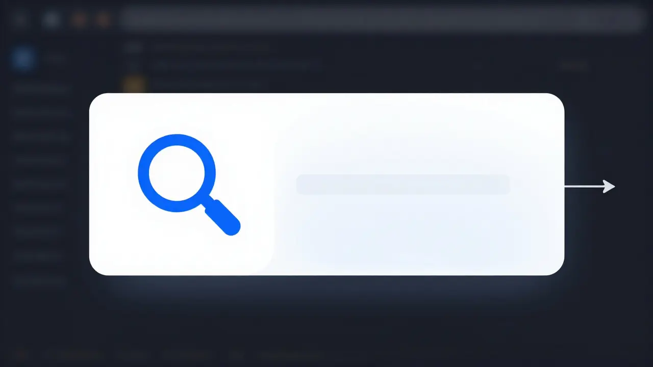
Callouts should be minimalist. Too much text turns a video into a reading exercise. Aim for short phrases or single words. Use icons where possible; a magnifying glass icon often conveys "search" faster than the word itself.
| Element | Recommendation | Reason |
|---|---|---|
| Background Color | Semi-transparent black or white | Ensures readability over any background |
| Font Size | Minimum 24pt equivalent | Legible on mobile devices |
| Duration | Longer than spoken reference | Allows time for reading and comprehension |
| Arrow Direction | Point directly to target | Clear visual connection between text and object |
Timing Matters
The biggest pitfall with callouts is timing. If the callout appears too early, it distracts from the current action. If it appears too late, the student has already missed the point. Sync the appearance of the callout with the exact moment you mention the concept in your narration. Let it stay on screen slightly longer than you speak about it, giving slower readers time to absorb the information.
Use callouts to introduce jargon. If you are teaching a specialized tool, use a callout to define technical terms as they appear. This creates a self-contained learning experience where students don’t need to pause and look up definitions elsewhere.
Tools for Implementing Annotations
You don’t need Hollywood-level software to create these effects. Many popular video editing platforms support these features natively.
- OBS Studio: Free and open-source. You can use browser sources or image overlays to create custom callouts during recording. It requires more setup but offers real-time feedback.
- Camtasia: Built specifically for instructional video. It has pre-built templates for arrows, boxes, and zooms. It’s expensive but saves hours of manual editing.
- Adobe Premiere Pro: Professional grade. Offers precise control over motion paths and opacity. Best for creators who want full creative freedom and already own the Adobe suite.
- Canva Video: Surprisingly capable for simple tutorials. Drag-and-drop stickers and text boxes make it easy for beginners to add basic annotations without a steep learning curve.
Choose a tool based on your volume of content. If you produce dozens of videos a month, invest in automation-friendly tools like Camtasia. If you produce occasional high-quality courses, Premiere Pro gives you the polish you need.
Common Pitfalls to Avoid
Even experienced creators fall into traps. Here are three common mistakes that undermine the effectiveness of your annotations.
1. Cluttering the Screen Too many animations fighting for attention cancel each other out. If you are zooming, don’t also flash a highlight and pop up a callout simultaneously. Pick one primary method per scene. Let the visual breathe.
2. Ignoring Mobile Viewers Over half of online course consumption happens on phones. Test your videos on a mobile device. Are your callouts readable? Is the zoom level appropriate? Text that looks fine on a laptop may be microscopic on a phone.
3. Inconsistent Styling Use the same color palette, font family, and animation speed throughout your course. Consistency builds brand recognition and reduces cognitive friction. Students shouldn’t have to relearn how to interpret your visuals every time they start a new lesson.
Putting It All Together: A Workflow Example
Imagine you are teaching a Photoshop tutorial on removing backgrounds. Here is how you would layer these techniques:
- Start Wide: Show the entire canvas to establish context.
- Narrate Action: Say, "Select the Magic Wand tool."
- Highlight: Add a glowing border around the Magic Wand icon in the toolbar.
- Zoom In: Smoothly push in to the subject’s hairline, where the selection needs refinement.
- Callout: Display a small text box: "Refine Edge Brush" pointing to the relevant option in the properties panel.
- Pull Out: Return to the full view to show the final result.
This sequence guides the viewer through the cognitive steps of the task: identify the tool, locate the area, apply the technique, and verify the result. Each annotation serves a distinct purpose, building upon the previous one.
What is the best color for screen highlights?
Bright yellow or neon green works best for general emphasis because they contrast well with most UI colors. Avoid red unless indicating errors, as it signals danger. Blue is a good neutral alternative for professional interfaces.
Should I annotate my videos during recording or in post-production?
Post-production is generally better. It allows for precise timing, consistent styling, and the ability to fix mistakes without re-recording. Real-time annotation can be distracting and often lacks the polish needed for professional courses.
How much should I zoom in on my screen?
Zoom until the target element is clearly visible but still retains some surrounding context. A good rule is to ensure text is at least 24 points in size on a standard HD screen. Never zoom so far that the viewer loses orientation within the application.
Are callouts necessary for simple tutorials?
Yes, even for simple tasks. Callouts reinforce verbal instructions and help non-native speakers or those with hearing impairments. They serve as a visual anchor that supports multiple learning styles.
Which software is best for beginners adding annotations?
Camtasia is ideal for beginners due to its drag-and-drop interface and pre-made assets. Canva is also excellent for very simple, slide-based tutorials. Both require minimal technical skill to produce professional-looking results.