

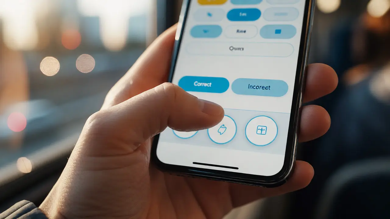
You know that frustrating moment when you’re trying to answer a quiz on your phone during your commute, and your thumb slips? Or when a button is so tiny you accidentally close the whole app instead of submitting your answer? It’s not just bad luck. It’s bad design. In mobile learning, or m-learning, the interface is the classroom. If the door sticks, students won’t walk through it.
Designing for touch isn’t just about making things look pretty on a small screen. It’s about respecting human anatomy, cognitive load, and the messy reality of how people actually use their devices. We aren’t sitting at desks with mice anymore. We’re walking, standing in line, holding coffee, and typing with one hand while the other holds a baby. This guide breaks down exactly how to build touch interfaces that keep learners engaged, not frustrated.
The Thumb Zone Reality Check
Let’s start with the most basic constraint: thumbs. Most mobile users are right-handed. When they hold a phone, their thumb can easily reach the bottom half of the screen without shifting their grip. The top corners? That’s danger zone. You need to shift your hand, risk dropping the device, or stretch awkwardly.
In educational contexts, this matters because distraction kills retention. If a learner has to stop thinking about the content to figure out how to reach the "Next" button, you’ve broken their flow. Apple’s Human Interface Guidelines and Material Design both emphasize placing primary actions within easy reach. For learning apps, this means navigation bars should be at the bottom, not the top. Submit buttons should be large and centered in the lower third of the screen.
Consider a scenario: a student is reviewing flashcards. If the "Correct" and "Incorrect" buttons are at the top, they have to lift their thumb repeatedly. Put them side-by-side at the bottom, and the interaction becomes muscle memory. They can swipe or tap rapidly, keeping their mental energy focused on the material, not the mechanics.
Sizing and Spacing: The 44-Pixel Rule
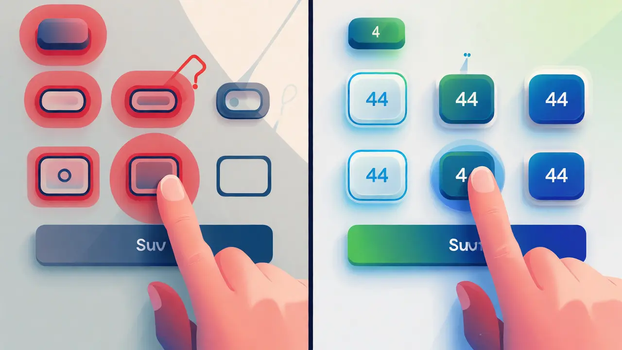
Here is a hard number you need to memorize: 44x44 points (or pixels, depending on your platform). This is the minimum recommended size for touch targets by both iOS and Android standards. Why? Because the average adult fingertip covers about 8-10mm on a screen. Anything smaller than 44 points increases the error rate significantly.
But size isn’t enough. You also need spacing. If two buttons are too close together, a user might hit the wrong one. This is especially critical in assessment questions where selecting the wrong option changes the grade. Aim for at least 8 points of padding between interactive elements. If you’re designing a multiple-choice question, don’t cram four options tightly together. Give each option its own generous block.
A common mistake in older e-learning modules ported to mobile is shrinking desktop-sized checkboxes. On a desktop, a checkbox might be 16x16 pixels. On mobile, that’s invisible. Wrap those checkboxes in larger clickable areas. Make the entire row of text clickable, not just the tiny box. This reduces friction and speeds up completion times.
Feedback Loops: Did I Tap That?
Touchscreens lack tactile feedback. When you press a physical key, you feel resistance. When you tap glass, you feel nothing. This creates uncertainty. Did my tap register? Am I double-tapping? Is the app frozen?
To fix this, you need visual and haptic cues. Every tappable element must have a clear "pressed" state. Change the color slightly, add a shadow, or show a ripple effect. This confirms the action was received. For critical actions like submitting an assignment, pair this with haptic feedback-a subtle vibration. Studies in human-computer interaction suggest that haptic confirmation reduces user anxiety and perceived latency.
Don’t rely solely on visual changes for users with visual impairments. Ensure high contrast ratios between normal and pressed states. WCAG 2.1 guidelines recommend a contrast ratio of at least 3:1 for non-text UI components. Test your designs with grayscale filters to ensure the state change is still obvious.
Gestures vs. Buttons: Choosing the Right Tool
Swipe, pinch, long-press, drag-and-drop. Gestures feel modern and save screen real estate. But are they good for learning? Sometimes, no.
Swiping to reveal a menu is great for hiding navigation. But swiping to delete a lesson? Risky. What if the student didn’t mean to delete it? There’s no undo gesture that feels natural. For destructive actions, always provide a confirmation dialog or a visible trash icon. Don’t make learners guess the secret handshake.
Drag-and-drop is excellent for matching exercises. Moving a term from Column A to Column B feels intuitive. However, ensure the drop zones are large. If the target area is small, the frustration mounts quickly. Also, provide an alternative method. Not everyone can perform precise drag gestures due to motor control issues. Allow tapping to select, then tapping to place, as a fallback.
Remember, discoverability is low for gestures. Unlike a button labeled "Submit," a swipe-to-delete has no label. Use onboarding tooltips sparingly, but prefer visible affordances. If a feature is critical for learning progress, put a button there. Save gestures for secondary functions.
Accessibility Beyond Compliance
Mobile learning often serves diverse populations, including students with disabilities. Touch interface design must align with accessibility standards, not just tick boxes. Screen readers like VoiceOver (iOS) and TalkBack (Android) interact differently with touch elements than sighted users do.
Ensure all interactive elements have proper ARIA labels. A button that looks like a play icon needs a label saying "Play Lesson Video." Without it, a screen reader might just say "Button." That’s useless context.
Also, consider motion sensitivity. Parallax effects and auto-playing videos can trigger nausea in some users. Provide a setting to reduce motion. In a learning context, this is crucial. If a student gets dizzy navigating your module, they won’t finish the course.
| Element | Best Practice | Why It Matters |
|---|---|---|
| Navigation Bar | Bottom-aligned, max 5 items | Reduces thumb strain; keeps focus on content |
| Input Fields | Auto-focus, correct keyboard type | Speeds up data entry; reduces errors |
| Buttons | Min 44pt height, high contrast | Prevents mis-taps; aids visibility |
| Forms | Single column layout | Easier scanning on narrow screens |

Offline First: Designing for Real Life
Most mobile learners aren’t on stable Wi-Fi. They’re on spotty 4G, underground trains, or rural areas with weak signals. Your interface must handle connectivity issues gracefully.
Don’t let the app crash if the connection drops. Show a clear offline mode indicator. Allow users to download lessons beforehand. When they try to submit work while offline, queue the submission locally and sync when the connection returns. Display a friendly message: "We’ll send this when you’re back online." Never lose a student’s unsaved progress. Local storage is your best friend here.
Also, optimize media loading. High-res video buffers poorly on slow connections. Offer quality settings or use adaptive bitrate streaming. If a video fails to load, provide a transcript immediately. Don’t leave a blank space mocking the user.
Testing with Real Thumbs
Finally, test your designs on actual devices. Emulators lie. They assume perfect posture and steady hands. Go outside. Try using your prototype while walking. Try it with gloves on. Try it with one hand.
Watch how users struggle. Where do they hesitate? Where do they shake the phone in anger? These moments reveal design flaws faster than any heuristic evaluation. Iterate based on these observations. Mobile learning succeeds when the technology disappears, leaving only the education.
What is the ideal size for touch targets in mobile learning apps?
The industry standard is a minimum of 44x44 points (iOS) or 48x48 dp (Android). This ensures that even users with larger fingers or limited dexterity can accurately tap buttons without triggering adjacent elements. Always prioritize this size over aesthetic minimalism.
How does thumb reach affect mobile learning design?
Thumb reach dictates that primary actions should be placed in the bottom half of the screen. Placing critical buttons like "Submit" or "Next" at the top requires awkward hand adjustments, which interrupts cognitive flow and increases user fatigue during long study sessions.
Should I use gestures or buttons for navigation?
Use buttons for primary, frequent actions because they are visible and discoverable. Reserve gestures for secondary functions or advanced users. In learning contexts, clarity trumps novelty. If a gesture saves time but confuses users, it’s likely not worth the trade-off.
How do I handle form inputs on mobile devices?
Use single-column layouts for forms to avoid horizontal scrolling. Trigger the correct virtual keyboard automatically (e.g., numeric keypad for phone numbers, email keyboard for emails). Auto-focus on the first field to save the user a tap. Keep fields concise to minimize typing effort.
What role does haptic feedback play in mobile learning?
Haptic feedback provides tactile confirmation of interactions, reducing uncertainty about whether a tap registered. Subtle vibrations for successful submissions or incorrect answers can enhance engagement and accessibility, particularly for users who may miss visual cues.