
Teaching UI design isn’t about showing students how to make things look pretty. It’s about helping them solve real problems with clear, consistent, and predictable interfaces. Too many design courses focus on aesthetics-gradients, fonts, color palettes-while ignoring the core of what makes a UI actually work. Students graduate knowing how to make something look modern, but not how to make it usable.
Start with the user’s mental model
Before you show a student how to arrange buttons or pick a dropdown style, ask them: What does the user expect to happen here? This is the foundation of every good UI pattern. People don’t think in design systems. They think in tasks: How do I pay this bill? How do I find my order? How do I cancel this subscription?
When users encounter something unfamiliar, they fall back on patterns they’ve seen before. A shopping cart icon means ‘items to buy.’ A magnifying glass means ‘search.’ A hamburger menu means ‘more options.’ If you break these expectations, users get frustrated-even if your design is beautiful.
Teach students to map out the user’s journey first. Use simple paper sketches or sticky notes. Ask: Where do they start? Where do they get stuck? What do they think will happen next? This habit turns design from decoration into problem-solving.
Pattern libraries aren’t optional-they’re the backbone
One of the biggest mistakes in teaching UI design is skipping pattern libraries. Students often jump straight into Figma or Adobe XD and start designing from scratch. That’s like teaching someone to write essays without teaching them grammar.
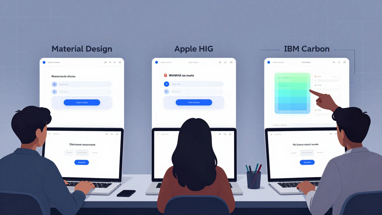
Introduce them to established pattern libraries like Material Design, Apple’s Human Interface Guidelines, and IBM’s Carbon. These aren’t just style guides-they’re collections of tested solutions to common problems. Show them how a date picker works across platforms. Why does iOS use a wheel? Why does Android use a calendar grid? What happens when you mix them?
Have students rebuild a simple feature-like a login screen-using three different libraries. Then compare: Which one feels fastest? Which one causes the most errors? Which one matches the target audience’s expectations? This exercise forces them to think about context, not just looks.
Consistency beats creativity in UI
Students often want to be ‘creative’ with buttons, icons, or navigation. That’s fine for branding. But in UI, creativity is the enemy of usability.
Teach them the rule: Same action, same look. Same look, same action. If a button is rounded and green in one place, it should be rounded and green everywhere it means ‘primary action.’ If a trash icon deletes something in the settings, it shouldn’t archive something in the inbox.
Use real examples. Show them a poorly designed app where the ‘Save’ button is blue on one screen and gray on another. Ask: What happens when a user clicks it? Do they trust it? Do they hesitate? Do they worry they’ll lose their work?
Consistency builds trust. Trust reduces cognitive load. Lower cognitive load means fewer mistakes and happier users.
Feedback is not a feature-it’s the default
When a user presses a button, what do they see? Nothing? A loading spinner? A confirmation message? Too many students design interfaces that leave users guessing.
Teach them that every interaction needs immediate, clear feedback. If a form is submitted, show a success message. If there’s an error, point to the field and say why. If something is loading, don’t just freeze the screen-show progress.
Use real-world analogies. Think of a vending machine: if you press a button and nothing happens, you press it again. And again. And then you shake it. That’s what happens in bad UIs. Good UIs give you feedback before you even realize you need it.
Have students record a peer using their design. Watch where they pause. Where they click repeatedly. Where they look confused. Those moments are gold. They’re not design flaws-they’re learning opportunities.
Accessibility isn’t an add-on-it’s the baseline
Too many design courses treat accessibility as a checkbox: ‘Add alt text. Make contrast high. Done.’ That’s not accessibility. That’s compliance.
Teach students that accessibility is about inclusion. A screen reader user shouldn’t have to guess what a button does because it’s just an icon. A colorblind user shouldn’t rely on red to indicate errors. A motor-impaired user shouldn’t need to tap a tiny target in the corner of the screen.
Use tools like WebAIM’s Contrast Checker and axe DevTools in class. Have students design a form with one color-only indicator (like ‘red for error’) and then test it with grayscale mode turned on. Show them how many people can’t tell the difference.
Make accessibility a daily habit. Every design critique should include: ‘Who might struggle with this?’ Not as a bonus question. As the first question.
Test early, test often, test with real people
Students think testing means running a survey or getting feedback from classmates. Real testing means watching someone use your design without your help.
Set up simple usability tests in class. Give students a task: ‘Find your last order and reorder it.’ Give them a clickable prototype. Sit quietly. Don’t help. Take notes. How long did it take? Where did they click wrong? What did they say out loud?
One student designed a checkout flow with five steps. Users took 4 minutes to complete it. Then she simplified it to three steps. Time dropped to 45 seconds. That’s not design magic-that’s testing.
Teach them to ask: ‘What would you do next?’ not ‘Do you like this?’ The first question reveals behavior. The second reveals preference. Behavior is what matters.
Teach the ‘why’ behind the pattern
Don’t just say: ‘Use a bottom navigation bar on mobile.’ Explain why: thumbs reach better. Users don’t have to scroll up. It’s one tap away. Show them research from Nielsen Norman Group on thumb zones. Show them heatmaps from real apps.
When students understand the reason behind a pattern, they can adapt it. They won’t copy blindly. They’ll ask: ‘Does this make sense for our users?’ That’s when they stop being followers and start being designers.
Build a shared vocabulary
Design students often use vague terms: ‘It feels off.’ ‘It looks cluttered.’ ‘I don’t like it.’ That’s not feedback. That’s opinion.
Teach them to speak the language of UI: affordance, hierarchy, cognitive load, F-pattern, chunking, error prevention, feedback loop. Define each one. Use examples. Have them identify these in apps they use daily.
When a student says, ‘This page is too busy,’ ask: ‘Which elements are competing for attention? What’s the visual hierarchy here?’ That shifts the conversation from emotion to analysis.
Don’t teach tools-teach thinking
Figma, Sketch, Adobe XD-they’re important. But they’re tools. You can teach someone how to use a hammer in an hour. Teaching them how to build a house takes years.
Focus on decision-making. Why choose a modal over a new page? Why use a tab bar instead of a sidebar? What’s the cost of adding another option to a menu?
Use case studies. Show them the redesign of the BBC News app. Why did they remove the hamburger menu? What happened to engagement? What did users say? Then ask: ‘If you were redesigning a banking app, what would you change-and why?’
Real projects, real stakes
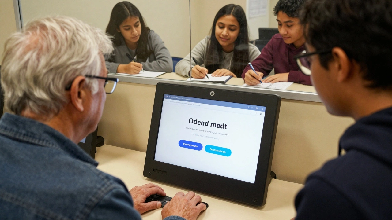
Assign projects that matter. Not ‘design a portfolio site.’ Design a mobile app for elderly users to book doctor appointments. Design a dashboard for teachers to track student progress. Design a kiosk for a public library.
These aren’t hypotheticals. They’re real problems. Real users. Real consequences. When students design for someone who can’t read well or has slow internet, they stop treating UI as decoration.
Partner with local nonprofits, schools, or community centers. Let students test their designs with real people. The feedback they get will change how they think forever.
What to avoid
- Don’t let students start with color palettes before they’ve defined the user flow.
- Don’t let them copy Instagram or TikTok UIs without understanding why those patterns work for social apps but fail in banking or healthcare.
- Don’t let them skip testing. No design is good until it’s been used by someone who didn’t build it.
- Don’t reward ‘clever’ designs that confuse users. Reward clarity.
Final thought: Good UI is invisible
The best UI doesn’t make you think. It doesn’t make you pause. It doesn’t make you wonder. It just works.
Teach your students to design for that. Not for portfolios. Not for likes. Not for trends. For people.
What’s the most important UI design pattern for beginners to learn?
The most important pattern is consistency. Users rely on predictability. If a button looks and acts the same way everywhere, they don’t have to relearn how to use your app. Start by mastering button styles, navigation placement, and feedback states across all screens.
Should students use design systems like Material Design in class projects?
Yes. Design systems exist because they solve real problems. Using Material Design or Apple’s guidelines teaches students how professional teams build scalable interfaces. It’s not about copying-it’s about learning how structure supports usability. Once they understand the rules, they can break them intentionally.
How do you teach accessibility without making it feel like a chore?
Frame it as empathy, not compliance. Have students try using their own designs with screen readers or while wearing gloves. Let them experience the frustration. When they realize how many people struggle with what they take for granted, accessibility stops being a checklist and becomes a mission.
Is Figma the only tool students need to learn?
No. Figma is popular, but the goal isn’t tool mastery-it’s design thinking. Students should learn to communicate ideas quickly, whether through paper sketches, wireframes, or clickable prototypes. Once they understand user flows and feedback loops, switching tools is easy. Focus on the problem, not the software.
How do you evaluate a student’s UI design project?
Don’t judge it by how ‘pretty’ it looks. Judge it by how few questions users had while using it. Did they complete tasks without help? Did they make mistakes? Did they say, ‘That was easy’? Those are the real metrics. Use usability test recordings as grading evidence.
Next steps for instructors
- Start each semester with a 30-minute usability test using a real app (like a banking app or government portal). Have students observe and report what went wrong.
- Build a classroom library of UI patterns with annotated examples from real apps.
- Invite local UX designers for a 20-minute critique session-no slides, just real feedback on student work.
- Require at least one project to be tested with users outside the class-elderly users, non-native speakers, or people with limited tech experience.
Comments
Paritosh Bhagat
Okay but let’s be real-most design students don’t even know what a mental model is. They think ‘pretty’ means ‘good.’ I’ve seen portfolios with gradient explosions and micro-interactions everywhere, but the login button is hidden under three layers of menus. It’s not creativity, it’s chaos. And no, your neon pink button doesn’t make your app ‘bold,’ it makes it look like a 2008 MySpace page.
Adrienne Temple
This is so true. I taught a workshop last month and one student designed a whole app with no feedback at all. User pressed ‘submit’ and… nothing. Just silence. Then they got mad because the app ‘didn’t work.’ We spent 20 minutes just explaining that people need to know something happened. It’s not magic-it’s basic human psychology. 😅
Tom Mikota
Consistency? Yeah. But also-don’t let them copy Material Design like it’s the Bible. I had a kid use floating action buttons on a desktop banking app. Like, why? Why?! It’s not a phone. It’s not a tablet. It’s a freaking laptop. You’re not designing for Instagram-you’re designing for someone trying to fix their taxes at 2 a.m.
Ben De Keersmaecker
One thing I’ve noticed: students equate ‘minimalist’ with ‘empty.’ They remove all labels, all text, all context-and call it ‘clean.’ But if a user has to guess what an icon means, it’s not minimalist-it’s lazy. The F-pattern isn’t a suggestion; it’s a biological reality. People scan left to right. Teach them that before they touch a grid system.
Antonio Hunter
I’ve been teaching UI for 12 years, and the biggest shift I’ve seen is how students now think about accessibility. Not as a ‘nice-to-have’ or a legal checkbox-but as part of the core design process. One of my students redesigned a pharmacy app for elderly users after her grandmother struggled to refill prescriptions. She added voice navigation, larger tap targets, and simplified language. The app went from 78% task failure to 94% success. That’s not design-that’s humanity. And it’s what we should be measuring.
Tools matter, yes. But if you can’t explain why a button is placed where it is, or why the color contrast matters to someone with low vision, then you’re not a designer-you’re a decorator. And decoration doesn’t save lives. Usability does.
When I ask students to test with real users, I don’t let them sit in the room. I make them leave. I tell them to watch silently. The moments of silence, the repeated clicks, the confused sighs-that’s where the real design work begins. Not in Figma. Not in a mood board. In the quiet frustration of someone trying to get their medicine.
And yes, I’ve had students cry after their first usability test. Not because they failed-but because they finally understood what they were actually designing for. People. Not pixels.
That’s the moment they stop being students and become designers.
Sandy Dog
OH MY GOSH YES. I had a professor who made us redesign a hospital app after watching someone struggle to book a doctor’s appointment. The user was 72. She kept tapping the same button over and over because there was no feedback. She thought the app was broken. It wasn’t. It was just… silent. And then I realized-how many people are out there just giving up because no one thought to tell them ‘it’s loading’? I cried. Like, full ugly tears. 🥹 This isn’t just design-it’s emotional labor. And we owe it to people to not make them feel dumb.
Jawaharlal Thota
Most design schools still teach Photoshop as the main tool. That’s like teaching typing on a typewriter. Figma is free, collaborative, real-time-why are we still using legacy tools? And why do we let students design in isolation? Real design happens in teams. Real feedback comes from users who don’t care about your ‘aesthetic vision.’ They just want to pay their bill without calling customer service.
I once had a student build a whole app with perfect gradients but no error messages. When I asked why, he said, ‘I didn’t want to scare users.’ I said, ‘Then you’re scaring them by making them think they did something wrong.’ That’s the disconnect. We’re not designing for perfection-we’re designing for resilience. For mistakes. For confusion. For human error.
Teach them to expect failure. Then design for it.
Lauren Saunders
Let’s be honest-this entire post is just a rehash of Nielsen Norman Group’s 2005 whitepaper. ‘Consistency is king.’ ‘Test early.’ ‘Accessibility is baseline.’ Newsflash: everyone knows this. What’s missing is the critique of these ‘best practices’ as cultural artifacts. Why is a hamburger menu ‘bad’? Because Western UX dogma says so. In some cultures, hidden navigation is preferred. Who gets to define ‘usable’? The same people who built the web for able-bodied, literate, English-speaking men in Silicon Valley.
Don’t teach patterns. Teach power structures.
Chris Heffron
Love this. One thing I always tell my students: if you can’t explain the ‘why’ behind a button’s color, you shouldn’t be allowed to pick it. 😅 I had one guy use purple for ‘submit’ because ‘it looked cool.’ Then he got mad when users didn’t click it. I said: ‘Purple isn’t a call-to-action color. Red is. Why? Because of decades of psychological conditioning. Not your taste.’ He still doesn’t get it. But hey, at least he tried.
sonny dirgantara
lol i just had a student ask me if he could make the back button a heart icon because ‘it’s more emotional’. i said ‘sure, but then people will think they’re breaking up with the app’.
Andrew Nashaat
Let’s not pretend this is revolutionary. Every single point here is textbook. What’s missing? Accountability. Who’s auditing these design programs? Who’s checking if students are actually testing with real users-or just their friends? Who’s ensuring accessibility isn’t just a slide in week 8? We’re training designers to be artists, not engineers. And that’s why 90% of apps suck. It’s not the tools. It’s the curriculum. And until schools stop rewarding ‘style’ over ‘function,’ we’re just putting lipstick on a pig.
Aaron Elliott
While the underlying principles articulated herein are, in principle, laudable, one cannot help but observe a conspicuous absence of epistemological rigor in the pedagogical framework proposed. The implicit assumption-that usability is an objective, universally quantifiable metric-fails to account for the phenomenological variability of human interaction. Moreover, the privileging of ‘consistency’ as a supreme value risks ossifying design into a rigid, algorithmic regime that suppresses emergent, context-sensitive affordances. One must ask: Is the goal of UI design to eliminate cognitive friction entirely-or to cultivate a dynamic, adaptive interface that responds to the dialectical nature of human behavior? The answer, I suspect, lies not in pattern libraries, but in the existential interrogation of the user’s being-in-the-world.