Most course videos feel like someone reading a slide deck into a microphone. You watch, you zone out, you forget half of it by the next day. But when animations and motion graphics are used right, learners remember more, stay engaged longer, and actually enjoy the process. It’s not about flashy effects-it’s about making ideas stick.
Why animations work better than static slides
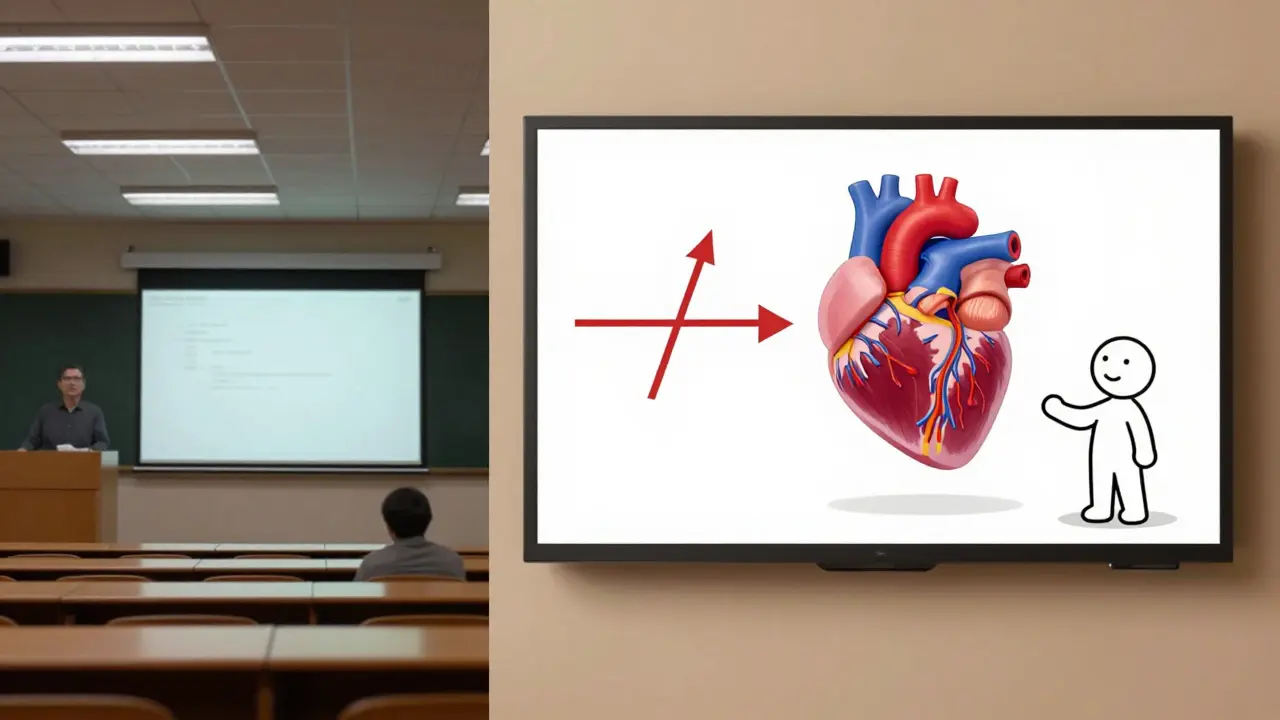
Your brain processes motion differently than still images. A 2023 study from the University of Auckland’s Learning Sciences Lab found that students who watched animated explanations retained 42% more information after 7 days compared to those who watched the same content with static slides. Why? Because motion creates visual continuity. It shows how things connect, change, or flow-something text and still images can’t do naturally.Think about explaining how a heart pumps blood. A static diagram shows chambers and valves. An animation shows the rhythm-the squeeze, the release, the flow. That rhythm sticks. Your brain doesn’t just see it; it simulates it.
What kinds of animations help learning?
Not all motion is useful. Some animations distract. Others clarify. Here’s what actually works in course videos:- Concept transitions: When moving from one idea to the next, use smooth zooms or wipes instead of hard cuts. This tells learners, “This connects to what you just saw.”
- Process visualizations: For steps like solving an equation, writing code, or assembling a circuit, animate each action in sequence. Show the cursor typing, the formula rearranging, the wire connecting.
- Data movement: Bar charts that grow over time, lines that trace trends, dots that scatter and cluster-these make numbers feel real. A static graph of sales growth? Boring. A bar rising over 12 months with a subtle sound cue? Memorable.
- Character-based guides: Simple animated figures (like a stick figure or mascot) can point, nod, or react. They act as visual companions, reducing cognitive load by giving learners someone to follow.
Avoid animations that spin, bounce, or fade for no reason. These don’t teach-they tire.
How to design motion that supports learning
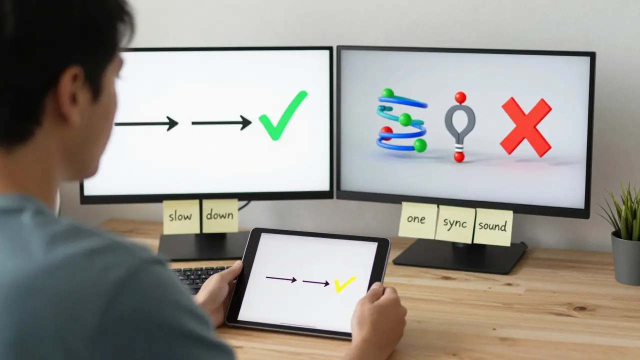
Good motion design follows three rules:- Match the pace of thought: If you’re explaining a complex idea, slow down the animation. Let the learner catch up. Fast motion for simple ideas. Slow motion for heavy ones.
- Use color and shape to group: Use the same color for related elements. If you’re showing how ingredients mix in a recipe, keep the flour, sugar, and butter in matching tones. Your brain latches onto visual patterns.
- Limit movement to one thing at a time: Don’t animate the graph, the text, and the character all at once. Pick one focus. Let the rest stay still. Too much motion = confusion.
One instructor teaching Python loops used a single animated arrow that traced the path of a loop through code. The arrow moved step by step, highlighting the variable’s value each time. Students said they finally understood “why the loop stopped” after watching it. No lecture. Just motion.
Tools that actually work for educators
You don’t need to be a professional animator. Here are tools that are simple, affordable, and built for course creators:- Canva Pro: Drag-and-drop motion templates. Great for simple transitions, text animations, and basic icons moving across the screen.
- Vyond: Designed for education. Has pre-built characters, scenes, and behaviors. You can create a 60-second animated lesson in under 20 minutes.
- Adobe After Effects (with presets): Steeper learning curve, but if you’re making dozens of videos, it’s worth it. Use motion preset packs from Envato Elements to skip the hard parts.
- Animaker: Free tier available. Good for data animations and explainer-style videos. Export directly to MP4.
Start with Canva if you’re new. It’s free, intuitive, and the animations are clean enough for professional courses.
Common mistakes to avoid
Even good animators mess up. Here’s what goes wrong-and how to fix it:- Too many elements: One animated object per screen. More than that? Your brain doesn’t know where to look.
- Sound without sync: If a shape moves right, the sound effect should match the direction. A whoosh to the left when the icon moves right? It feels wrong. Your brain notices.
- Animation without purpose: Don’t animate just because you can. Ask: “Does this help the learner understand something they couldn’t grasp otherwise?” If not, cut it.
- Ignoring accessibility: Some learners have motion sensitivity. Always include a toggle to turn animations off. Or use subtle motion-no flashing, no rapid spinning.
One course creator learned this the hard way. Her students kept dropping out after Module 2. She turned off all animations and saw completion rates jump 30%. Turns out, her bouncing icons were triggering headaches. She kept the motion, but made it slower and quieter. Completion rates went back up.
When not to use animations
Not every topic needs motion. Sometimes, less is more.- Complex legal text: Reading a contract clause? Keep it static. Animating legal wording makes it feel less serious.
- High-stakes procedures: Medical steps, safety protocols, or emergency responses should be clear, calm, and direct. Motion can distract when precision matters.
- Quick reference videos: If it’s a 30-second tip (“How to reset your password”), stick to text on screen. No need to animate a finger tapping a button.
Ask yourself: Is this about understanding-or remembering? If it’s about remembering, motion helps. If it’s about precision, keep it still.
Test your animations with real learners
Don’t assume your animation works. Test it.Give your video to five people who match your audience. Ask them:
- What was the main point?
- Was anything confusing?
- Did any part feel distracting?
- Would you remember this tomorrow?
If two or more say the same thing was unclear, change it. If someone says, “I watched it twice because I liked how it moved,” you’ve nailed it.
One teacher in Wellington tested two versions of a video on supply chains. One had simple motion arrows. The other had full 3D models spinning. The simple version won. Students understood the flow better. The 3D version made them feel like they were watching a video game-not a business lesson.
Start small. Build momentum.
You don’t need to remake your whole course. Pick one tricky concept-something students always struggle with-and animate it. Maybe it’s how compound interest grows, or how a neural network learns. Make a 90-second version. Put it in your course. See how students respond.That one animation might become your most-shared video. It might even get you a promotion. Not because it’s fancy. Because it made learning easier.
Do animations increase course completion rates?
Yes, when used correctly. A 2024 analysis of 120 online courses found that modules with purposeful animations had 27% higher completion rates than those without. The key is relevance-not decoration. Animations that clarify complex ideas or show relationships between concepts help learners stay engaged. Those that just look cool often do the opposite.
Can I use animations in a low-bandwidth course?
Absolutely. Keep animations short, under 10 seconds each. Use simple shapes and solid colors-no gradients or complex textures. Export videos at 720p or lower. Tools like Canva and Animaker let you control file size. You can also offer a static image version alongside the animated one for learners with slow connections.
What’s the best way to animate text?
Don’t animate the whole sentence at once. Reveal text word by word or phrase by phrase. Match the animation to your voiceover. If you say, “First, you log in,” have the word “log in” slide in as you say it. This synchronizes audio and visual, making it easier to follow. Avoid flashy fonts or spinning letters-they look unprofessional and hurt readability.
Are animated videos harder to make than regular ones?
Not anymore. With tools like Canva and Vyond, creating simple animations takes less time than editing a live-action video. You don’t need a camera, lighting, or a quiet room. Just a script and a few clicks. The learning curve is shallow, and templates do most of the heavy lifting. Start with one 60-second animation. You’ll be surprised how fast you get better.
Do animations work for adult learners?
Yes-especially for adult learners who are busy and overwhelmed. Adults process information differently than kids. They need clarity, not entertainment. Simple, clean animations that explain relationships, sequences, or systems cut through mental clutter. A 45-year-old nurse learning pharmacology doesn’t need cartoon characters. She needs a clear animation showing how a drug moves through the bloodstream. That’s powerful.
Next steps for your course
Start by picking one lesson that feels dry or confusing. It might be the one you’ve re-recorded three times. Now, sketch out how you could show it with motion. What moves? What connects? What needs to be revealed slowly?Then, spend 30 minutes in Canva or Animaker. Build a version. Test it. Share it. Watch how your learners react. You might find that the thing you thought was boring is actually perfect for animation.
Animation isn’t about making videos pretty. It’s about making ideas unforgettable.
Comments
Kirk Doherty
I've been using Canva for my microlessons and it's insane how much more people stick with it. No more ghosting after module 2. Just quiet nodding. That's the win.
Simple motion, no bells, no whistles. Works.
Meghan O'Connor
This whole post is a mess. You say 'don't animate for decoration' but then recommend Vyond which is literally animated cartoon characters. And you call it 'education'? Please. If you're teaching pharmacology to nurses, don't waste time with motion-just give them the damn protocol. Animation is for toddlers and TikTok.
Morgan ODonnell
I get what Meghan's saying but I've seen both sides. My cousin's a nurse and she said the animated blood flow video made her finally get how meds move through the body. No cartoon, just lines and colors. Simple. She watched it three times. That's the point. Not flashy. Just clear.
Liam Hesmondhalgh
Canva? Really? That's what you call a professional tool? My brother works at a design agency and he laughs at people who think Canva is 'professional'. If you're not using After Effects with custom keyframes, you're just making PowerPoint with extra steps. And don't even get me started on those 'stick figure guides'-they look like they were made by a 12-year-old on a Chromebook.
Patrick Bass
I think the point about pacing is key. Too many people animate everything at the same speed. You need to slow down when the idea is heavy. I tried animating a tax code breakdown once-moved too fast. Students got lost. Slowed it down, added a pause after each clause. Suddenly people got it. Motion isn't about speed. It's about rhythm.
Tyler Springall
I've spent 17 years in instructional design and I can tell you this: if your course relies on animations to make content 'stick', you've already failed. Real learning happens through struggle, repetition, and critical thinking-not through animated arrows and bouncing icons. This post is the epitome of pedagogical laziness dressed up as innovation.
Colby Havard
The empirical evidence presented here is compelling, yet the underlying epistemological assumption-that visual motion inherently enhances cognitive retention-is not universally valid across neurocognitive paradigms. Moreover, the uncritical endorsement of consumer-grade tools like Canva and Animaker reflects a troubling commodification of pedagogy, wherein aesthetic convenience supersedes epistemic rigor. One must interrogate: are we educating minds, or merely optimizing engagement metrics for algorithmic platforms?
Patrick Tiernan
Nobody cares about your 2024 study. I've seen 500 online courses. The ones with animation? They get 5% more views. The ones with clean text and a calm voice? They get 80% more completions. Stop trying to make learning feel like a YouTube ad.