

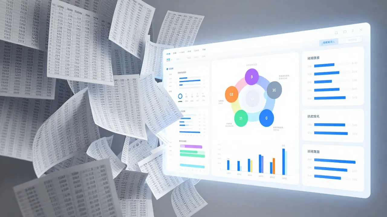
Imagine looking at a spreadsheet of student grades or employee training scores. It’s a sea of numbers. You see that Sarah scored 85% on Module 4, but what does that actually tell you about her ability to lead a team? Not much. That is where visualizing skills and competencies changes the game. Instead of raw data, you get clear, actionable insights into human potential.
In 2026, we have moved past simple pass/fail metrics. Organizations and educational institutions are using advanced analytics dashboards to map out exactly what people can do, not just what they memorized. This shift allows for personalized growth paths, better hiring decisions, and more effective curriculum design. But building these dashboards isn't just about picking pretty charts. It requires a solid understanding of learning analytics, data structure, and user experience.
The Shift from Grades to Competency Maps
Traditional education and corporate training have long relied on summative assessment. You take a test, you get a grade, you move on. The problem is that a single score flattens complex abilities. If an engineer gets a 70% on a coding exam, did they struggle with syntax, logic, or debugging? The number doesn’t say.
Competency mapping is the process of identifying the specific knowledge, skills, and behaviors required for success in a role or course. When you visualize this, you break down that 70% into granular components. You might discover the engineer is a master of Python syntax but struggles with API integration.
This granularity is the foundation of modern learning analytics. By tracking micro-skills rather than macro-grades, you create a dynamic profile of a learner. This profile updates in real-time as they complete tasks, watch videos, or collaborate on projects. The result is a living document of capability, far more useful than a static transcript.
Key Components of an Effective Skills Dashboard
Not all dashboards are created equal. A cluttered screen with too many widgets causes cognitive overload, defeating the purpose of clarity. To build a dashboard that drives action, you need to focus on three core components: data accuracy, visual hierarchy, and interactivity.
- Data Accuracy: Garbage in, garbage out. Your dashboard must pull from reliable sources like Learning Management Systems (LMS), HR Information Systems (HRIS), or performance management tools. Ensure your data definitions are consistent. For example, define "completed" clearly-does it mean watched 100% of a video, or passed a quiz?
- Visual Hierarchy: Guide the user's eye to what matters most. Use size, color, and position to highlight critical insights. A large radial gauge showing overall proficiency should sit above a small bar chart detailing minor sub-skills.
- Interactivity: Static images don't allow exploration. Users should be able to click on a skill node to see which courses contributed to it, or filter by department, date range, or job role.
For instance, a university advisor might use a dashboard to view a student's progress toward a degree. Clicking on "Critical Thinking" could reveal that the student has completed two relevant electives but missed a key seminar. This drill-down capability turns data into a conversation starter.
Choosing the Right Visualization Types
The way you present data dictates how it is understood. Using the wrong chart type can mislead stakeholders or obscure important trends. Here is a breakdown of the most effective visualizations for skills and competencies.
| Chart Type | Best Used For | Example Scenario |
|---|---|---|
| Radar Chart | Comparing multiple skills against a benchmark | Showing a salesperson's proficiency in negotiation, product knowledge, and CRM usage vs. the team average |
| Heatmap | Identifying gaps across a large group | Highlighting departments with low cybersecurity awareness scores |
| Sankey Diagram | Tracking flow and progression | Visualizing how students move from introductory courses to advanced specializations |
| Progress Bar / Gauge | Simple status updates | Displaying individual completion percentage for a mandatory compliance training |
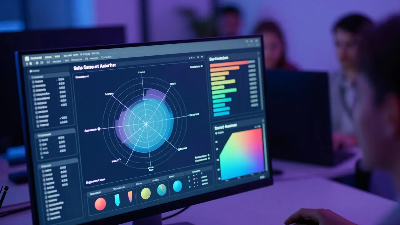
Radar charts are particularly powerful for competency modeling. They allow you to plot six to eight distinct skills around a circle. If the shape looks lopsided, it immediately signals an area for development. Heatmaps, on the other hand, are essential for organizational leaders. They provide a bird's-eye view of talent distribution, helping HR identify if there is a widespread lack of data literacy across the company.
Integrating Data Sources for Holistic Insights
A common pitfall in learning analytics is siloed data. Often, LMS data sits separately from performance review data. This separation prevents a true view of competency. To visualize skills effectively, you must integrate disparate data sources.
Data interoperability is the ability of different information systems to exchange and make use of information. In the context of learning analytics, this means connecting your LMS with your HRIS. Why does this matter? Because completing a course on leadership doesn't automatically mean someone is a good leader. By linking training completion data with manager feedback scores, you can validate whether the training actually improved performance.
Modern platforms often use APIs (Application Programming Interfaces) to facilitate this connection. For example, an organization might use xAPI (Experience API) standards to track learning experiences outside the traditional classroom, such as on-the-job mentoring or self-directed reading. These events feed into a Learning Record Store (LRS), which then powers the dashboard. This holistic approach ensures that the visualization reflects reality, not just attendance records.
Designing for Different User Personas
Who is looking at the dashboard? A one-size-fits-all approach rarely works. You need to tailor the view based on the user's role and needs.
- The Learner: Needs immediate, personal feedback. Their dashboard should focus on their own progress, recommended next steps, and badges or certifications earned. Keep it motivational and simple.
- The Manager: Needs to understand team capacity. Their view should aggregate individual data to show team strengths and weaknesses. They might look for who is ready for promotion or who needs additional support.
- The L&D Strategist: Needs high-level trends. They care about ROI, engagement rates, and skill gap analysis across the entire organization. Their dashboard should include historical comparisons and predictive analytics.
For example, a manager viewing a heatmap might see that their team lacks project management skills. They can then assign a specific certification path to those individuals. Meanwhile, the L&D strategist sees that project management is a gap across three departments and decides to negotiate a bulk license for a PM software tool. Same data, different actions.

Pitfalls to Avoid in Skills Visualization
Even with the best tools, mistakes happen. Here are common errors that undermine the value of analytics dashboards.
- Overcomplication: Trying to show every metric at once. If users have to guess what a line represents, you've failed. Stick to key performance indicators (KPIs).
- Lack of Context: Showing a score without a benchmark. Is 80% good? Only if you know the average is 60%. Always provide reference points.
- Ignoring Privacy: Displaying sensitive performance data publicly can demoralize employees. Ensure role-based access controls are in place so people only see what they are authorized to see.
- Static Snapshots: Skills change. A dashboard that shows data from six months ago is misleading. Automate refresh rates to ensure real-time relevance.
Privacy is especially critical in 2026 with stricter global data protection regulations. Anonymize data when presenting aggregate trends to larger groups. Allow individuals to opt-out of certain non-mandatory tracking features where legally permissible.
Future Trends: AI and Predictive Analytics
We are standing on the brink of a new era in learning analytics. Artificial Intelligence (AI) is beginning to play a central role in interpreting skills data. Instead of just showing you that a skill is declining, AI can predict why.
Machine learning algorithms can analyze patterns in engagement, time spent on tasks, and assessment results to forecast future performance. For instance, an AI might flag that employees who skip the second module of a cybersecurity course are 40% more likely to fail the final certification. This insight allows for proactive intervention, such as sending a reminder or offering additional resources before the failure occurs.
Natural Language Processing (NLP) is also enabling more intuitive interactions. Soon, you won't just click through menus; you'll ask questions like, "Show me the top performers in data science in the European region," and the dashboard will generate the visualization instantly. This democratizes data access, allowing non-technical users to gain deep insights without needing SQL skills.
Getting Started: A Practical Checklist
If you are ready to build or improve your skills dashboard, start with these steps.
- Define Your Goals: What decision will this dashboard help you make? Hiring? Curriculum adjustment? Career planning?
- Audit Your Data: What data do you currently have? Where are the gaps? Can you link LMS data to performance data?
- Select Your Tools: Do you need a custom-built solution using Tableau or Power BI, or an off-the-shelf LMS report builder? Consider your budget and technical expertise.
- Prototype: Start with a wireframe. Sketch out the layout. Get feedback from actual users before writing any code.
- Iterate: Launch a minimum viable product (MVP). Gather feedback. Refine the visuals and add features based on real usage patterns.
Remember, the goal is not to create the most beautiful chart. The goal is to create clarity. If your dashboard helps a manager coach an employee better, or helps a student choose the right major, it has succeeded.
What is the difference between learning analytics and business intelligence?
While both involve data visualization, learning analytics focuses specifically on educational outcomes, skill acquisition, and learner behavior. Business intelligence (BI) typically covers broader operational metrics like sales, revenue, and supply chain efficiency. However, the lines are blurring as organizations seek to connect learning investments directly to business performance.
Which tools are best for creating skills dashboards?
Popular choices include Tableau, Microsoft Power BI, and Looker for custom solutions. For integrated environments, many Learning Management Systems (LMS) like Cornerstone OnDemand, SAP SuccessFactors, and Moodle offer built-in reporting modules. The best choice depends on your data complexity and existing tech stack.
How do I measure the ROI of skills visualization?
ROI can be measured by tracking improvements in key performance indicators linked to the skills. For example, if a dashboard identifies a gap in customer service skills, and subsequent targeted training leads to a 15% increase in customer satisfaction scores, that improvement represents the return on investment.
Is it possible to visualize soft skills effectively?
Yes, but it requires qualitative data quantification. Soft skills like empathy or leadership are often measured through 360-degree feedback surveys, peer reviews, and behavioral assessments. These scores can then be plotted on radar charts or heatmaps alongside hard skills to provide a holistic view of an individual's capabilities.
What are the privacy concerns with skills dashboards?
The main concerns include unauthorized access to sensitive performance data and potential bias in algorithmic assessments. Organizations must implement strict role-based access controls, anonymize aggregate data, and regularly audit their algorithms for fairness to comply with regulations like GDPR and CCPA.