

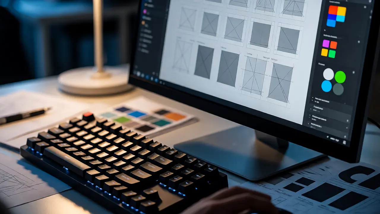
You stare at a blank canvas in Figma or a blinking cursor in VS Code. The screen mocks you. You know you need to make something look good, but where do you actually start? Do you learn HTML first? Or should you master color theory before touching a line of code? Most beginners get stuck in analysis paralysis because they treat Web Design as one giant, intimidating mountain instead of a series of small, climbable hills.
The truth is simpler than the bootcamps want you to believe. You don't need to be an artist or a computer scientist. You just need a structured path that balances visual logic with technical execution. This guide breaks down exactly what a solid web design curriculum looks like today, stripping away the fluff and focusing on the skills that actually get you hired or help you launch your own projects.
Key Takeaways
- Start with Visual Hierarchy: Before coding, learn how to guide the user's eye using size, contrast, and spacing.
- Code is Communication: HTML provides structure; CSS provides style. Learn them together, not separately.
- Responsiveness is Non-Negotiable: If it doesn't work on a phone, it doesn't exist. Mobile-first thinking is mandatory.
- Tools Change, Principles Don't: Whether you use Figma, Sketch, or Adobe XD, the underlying design rules remain constant.
- Build Real Projects: Tutorials give you dopamine; building ugly prototypes gives you skills.
Understanding the Core Pillars of Web Design
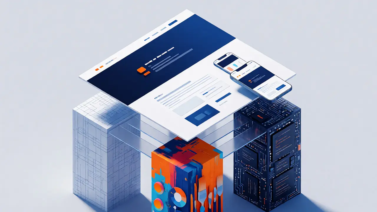
Let's clear up a common confusion immediately. Web Design isn't just about making things pretty. It sits at the intersection of three distinct disciplines: User Experience (UX), User Interface (UI), and Front-End Development. Many courses blur these lines, leaving students confused about their role.
Think of it like building a house. UX is the architect who decides where the doors go so people don't bump into walls. UI is the interior designer who chooses the paint colors and furniture layout to make the space feel welcoming. Front-end development is the construction crew that actually builds the walls and installs the lights. A good web designer needs to understand all three, even if they specialize in one.
When you look for a Learning Path, ensure it covers this triad. If a course only teaches you Photoshop tricks, you're missing the structural integrity. If it only teaches HTML tags, you're missing the aesthetic appeal. You need the bridge between the two.
The Foundational Skills: Typography, Color, and Layout
Before you open a code editor, you need to train your eye. These are the non-negotiables of visual communication. Skipping this step leads to websites that function but feel "off" to users, often without anyone knowing why.
Typography is 90% of Web Design
Most of the web is text. If your typography sucks, your design fails. A strong course will teach you more than just font names. It should explain hierarchy. What makes a heading different from body text? It's not just size; it's weight, line height, and letter spacing.
For example, using a sans-serif font like Inter or Roboto for body text improves readability on screens compared to traditional serif fonts. But you also need to know when to break the rule. A luxury brand might use a serif font like Playfair Display to convey elegance. Understanding these contextual cues is part of the curriculum.
Color Theory Without the Art School Jargon
You don't need to mix paints. You need to understand contrast ratios and emotional associations. A standard module in any decent Web Design Fundamentals course covers the WCAG (Web Content Accessibility Guidelines) standards. Why? Because low contrast isn't just ugly; it excludes users with visual impairments.
Learn the 60-30-10 rule. Use 60% for your primary background color, 30% for secondary elements, and 10% for accent colors (like buttons). This simple ratio prevents designs from looking chaotic or boring.
Layout and Grid Systems
Chaos is the enemy of usability. Grid systems bring order. In the past, designers used rigid tables. Today, we use flexible grids. You'll learn to align elements based on mathematical relationships rather than gut feeling. Tools like CSS Grid allow you to define rows and columns explicitly, ensuring your site looks organized on desktops and mobile devices alike.
Technical Essentials: HTML5 and Modern CSS
Now we get our hands dirty. Some purists argue designers shouldn't code. They're wrong. Even if you hand off designs to developers, understanding the constraints of HTML and CSS saves you hours of frustration later.
HTML5: The Skeleton
HTML is semantic. That means tags describe meaning, not just appearance. Using <header>, <nav>, <main>, and <footer> helps search engines and screen readers understand your page. A beginner mistake is using <div> for everything. A good course forces you to choose the right tag for the job.
CSS3: The Skin
CSS has evolved massively. Forget float hacks. Modern CSS uses Flexbox and Grid. Your learning path must include:
- Flexbox: For one-dimensional layouts (rows or columns).
- Grid: For two-dimensional layouts (complex page structures).
- Variables: Defining colors and spacing once and reusing them globally.
- Media Queries: Changing styles based on screen width.
If your course still spends weeks teaching Bootstrap classes without explaining the underlying CSS, run away. You need to understand the engine, not just drive the car.
The Role of Prototyping and Design Tools
Coding every idea from scratch is slow. Prototyping lets you test ideas quickly. This is where tools like Figma dominate the market. Unlike older tools, Figma runs in the browser and allows real-time collaboration.
A modern curriculum won't just show you which button to click. It will teach you component-based design. You create a "Button" component once. If you change its color, it updates everywhere in your design file. This mirrors how code works, making the handoff to developers smoother.
Don't ignore wireframing. Before adding colors and images, sketch the layout in grayscale. If the structure works without decoration, it's solid. If it looks empty, no amount of fancy gradients will save it.
Responsive Design: Beyond Just Shrinking Screens
Over 60% of global web traffic comes from mobile devices. Ignoring mobile design is business suicide. Responsive design isn't about squeezing a desktop site onto a phone. It's about prioritizing content.
On a large monitor, you might show a sidebar, main content, and footer simultaneously. On a phone, you stack them. But what happens to the navigation menu? It becomes a hamburger icon. Your course should cover touch targets-buttons need to be big enough for thumbs (at least 44x44 pixels). It should also cover performance. Large images kill mobile load times. Learning to optimize assets is part of the design process, not an afterthought.

Comparison of Popular Learning Paths
Choosing where to learn matters. Here’s how different approaches stack up against each other.
| Approach | Best For | Time Commitment | Cost | Outcome |
|---|---|---|---|---|
| Self-Paced Online Courses | Disciplined learners, budget-conscious | 3-6 months (flexible) | $20-$200 | Solid foundational knowledge, portfolio pieces |
| Bootcamps | Career switchers needing speed | 3-6 months (full-time) | $5,000-$15,000 | Job-ready skills, networking, career support |
| University Degree | Deep theoretical understanding, long-term | 3-4 years | $10,000+ per year | Broad education, recognized credential, slower entry |
| Mentorship/Apprenticeship | Practical application, feedback loops | Ongoing | Varies (often unpaid initially) | Real-world experience, direct industry insight |
Building Your Portfolio: From Tutorial Hell to Real Work
Here is the trap many students fall into: Tutorial Hell. You watch ten tutorials, follow along perfectly, and then freeze when asked to build something from scratch. Why? Because following instructions is passive. Building is active.
To break out, you need a capstone project strategy. Don't just copy a landing page. Redesign a local business website you think is bad. Explain your choices. Why did you change the font? Why did you move the contact form? Document your process. Show your wireframes, your color palette experiments, and your final coded result.
Include at least three types of projects in your portfolio:
- A Marketing Site: Focuses on aesthetics, conversion, and responsiveness.
- An Application Dashboard: Focuses on data visualization, complex layouts, and interactivity.
- A Personal Project: Shows your passion and ability to solve unique problems.
Staying Current: The Ever-Changing Landscape
Web design moves fast. What was trendy in 2020 (heavy shadows, skeuomorphism) looks dated now. Currently, minimalism, dark mode options, and micro-interactions are standard. But trends fade. Principles stick.
Your learning path shouldn't end when you finish a course. Subscribe to newsletters like Smashing Magazine or A List Apart. Follow designers on Twitter or LinkedIn who share their work-in-progress. Join communities like Reddit’s r/web_design or Discord servers dedicated to front-end development. The best way to learn is to see what others are struggling with and solving.
Also, pay attention to accessibility. As laws tighten globally, designing for inclusivity is becoming a legal requirement, not just a nice-to-have. Familiarize yourself with ARIA labels and keyboard navigation testing.
Do I need to know JavaScript to be a web designer?
Not necessarily for static sites, but it helps immensely. Basic JavaScript allows you to add interactivity like sliders, modals, and form validation. While frameworks like React are great for developers, a designer can often rely on CSS animations and libraries for most visual effects. However, understanding the logic behind JS makes collaborating with developers much easier.
Is Figma better than Adobe XD for beginners?
Yes, generally. Figma has become the industry standard due to its browser-based nature and free tier for individuals. It facilitates easy sharing and commenting, which is crucial for getting feedback. Adobe XD is still powerful, especially if you already use the Adobe Creative Cloud suite, but Figma's community resources and plugin ecosystem are currently unmatched.
How long does it take to learn web design fundamentals?
With consistent practice (10-15 hours a week), you can grasp the fundamentals in 3 to 6 months. This includes learning HTML/CSS, basic design principles, and creating a small portfolio. Becoming proficient enough to get a junior role usually takes closer to 6-12 months of active project building.
Should I learn WordPress or custom code first?
Learn custom HTML/CSS first. Understanding how the web works under the hood makes you a better WordPress developer. If you jump straight into page builders like Elementor without knowing CSS, you'll struggle to customize themes beyond the default settings. Once you understand the box model and selectors, WordPress becomes a powerful tool rather than a black box.
What is the biggest mistake beginners make?
Ignoring mobile responsiveness. Beginners often design for a wide desktop monitor and assume it will scale down magically. It rarely does. Always check your design on multiple screen sizes early in the process. Another common error is choosing too many fonts or colors, leading to visual clutter.
Comments
adam pohan
It is frankly disappointing to see yet another article that attempts to simplify the complex moral and technical obligations of web design into a series of 'hills' that can be easily climbed without proper ethical grounding. The author suggests that one should start with visual hierarchy but fails to address the fundamental issue that many designers lack the moral compass to understand why they are designing in the first place which leads to manipulative dark patterns that exploit user psychology for corporate gain rather than serving the human spirit. Furthermore the claim that code is communication ignores the fact that most modern frameworks abstract away the actual language of the browser creating a layer of obfuscation that serves developers more than users who deserve transparency and honesty in their digital interactions. We must remember that every pixel placed on a screen carries a weight of responsibility and if we do not teach our students to respect the dignity of the user then we are merely training them to be efficient slaves to capitalism rather than thoughtful artisans of the digital realm. The emphasis on tools like Figma over principles is also troubling because it suggests that proficiency in software equates to understanding of design when in reality true design wisdom comes from studying history philosophy and the human condition not just clicking buttons in a cloud based application. I urge all aspiring designers to look beyond the shiny surface of these tutorials and consider the deeper implications of their work on society as a whole because technology without ethics is merely chaos with better graphics.